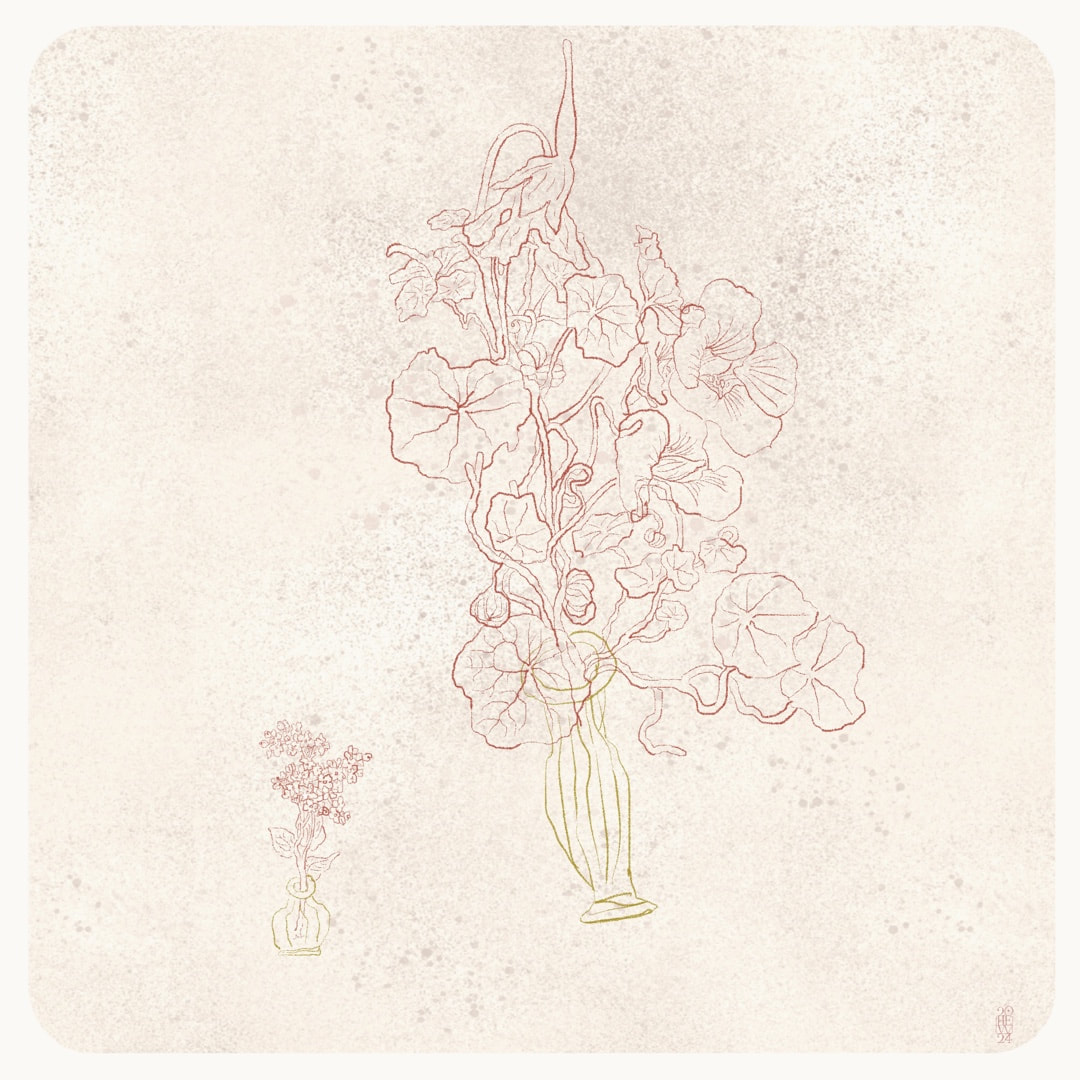
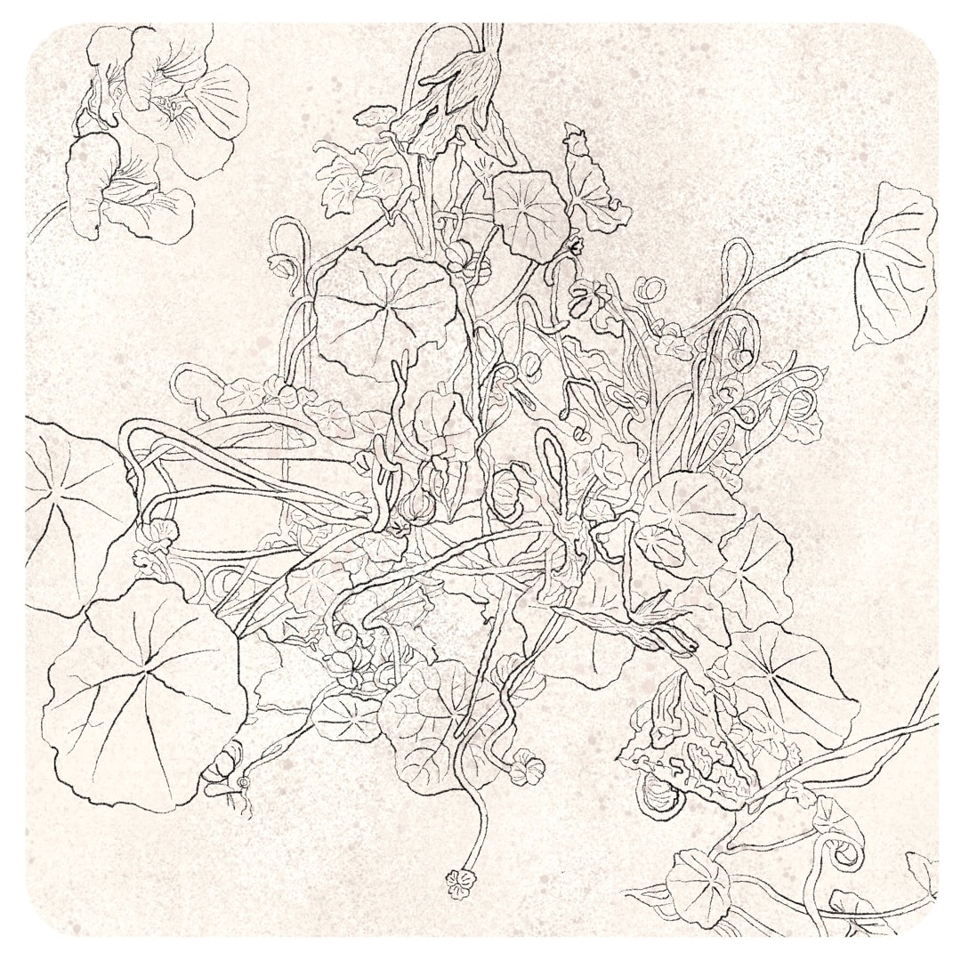
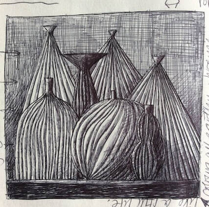
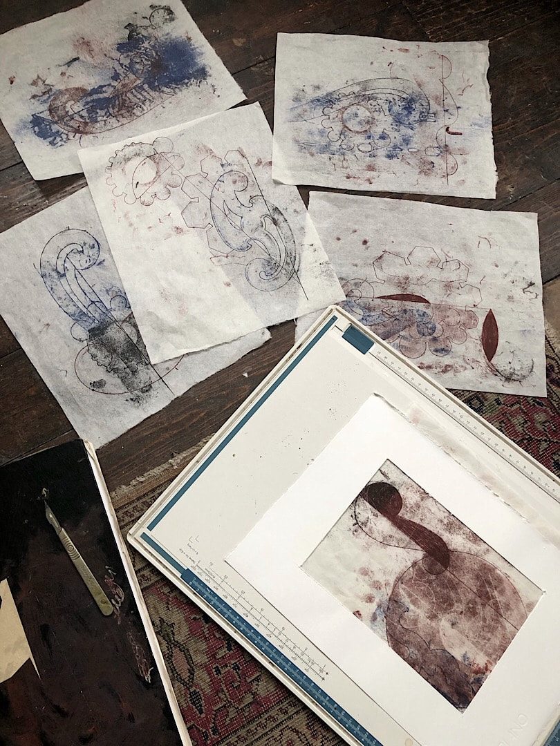
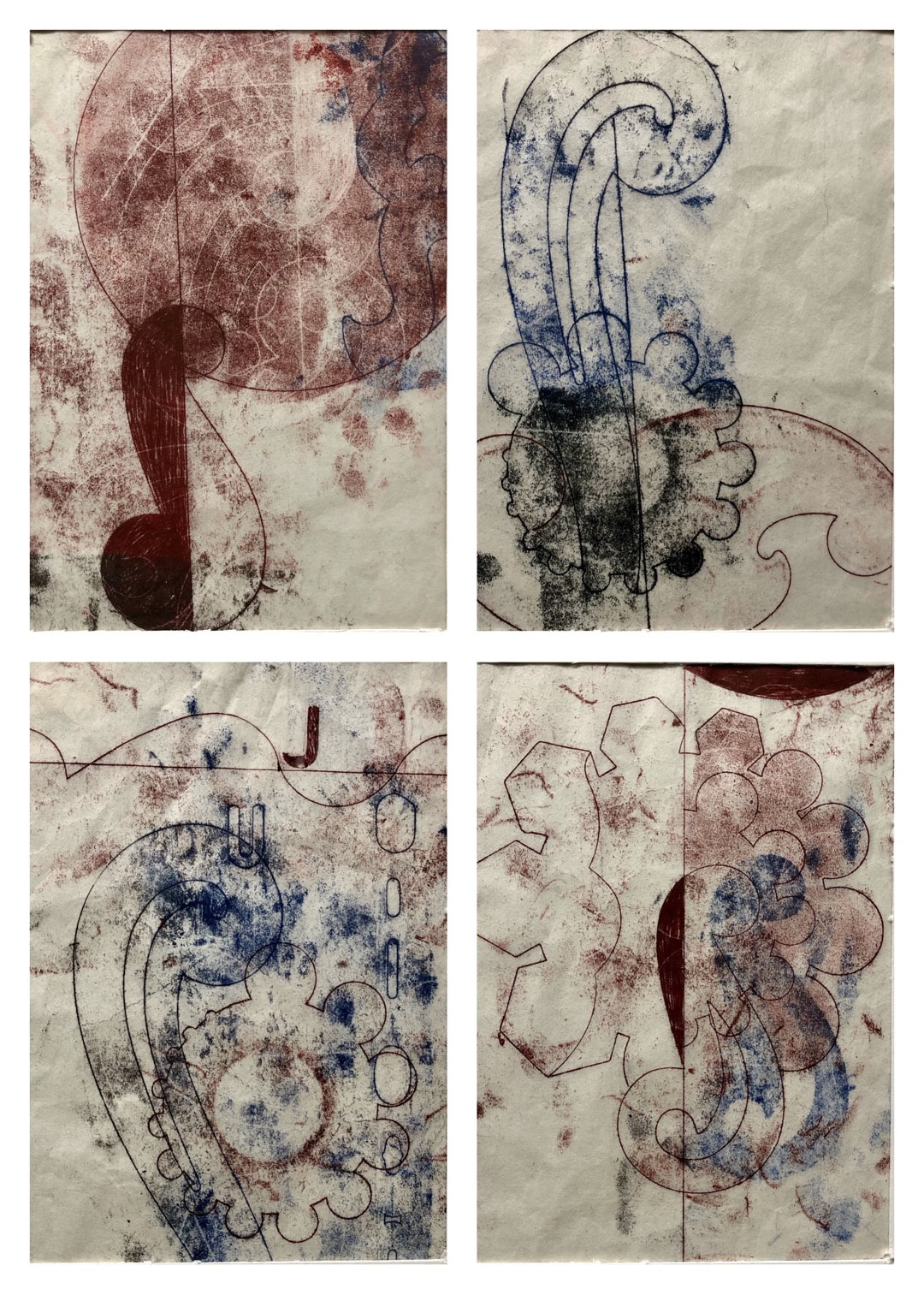
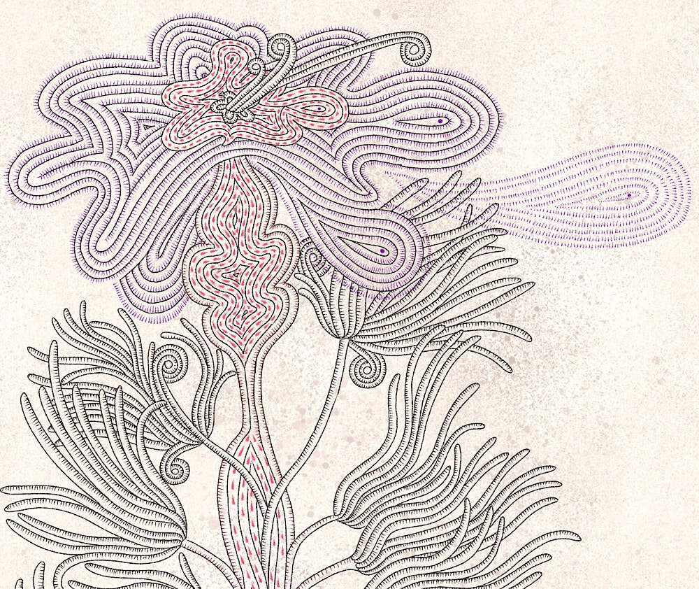
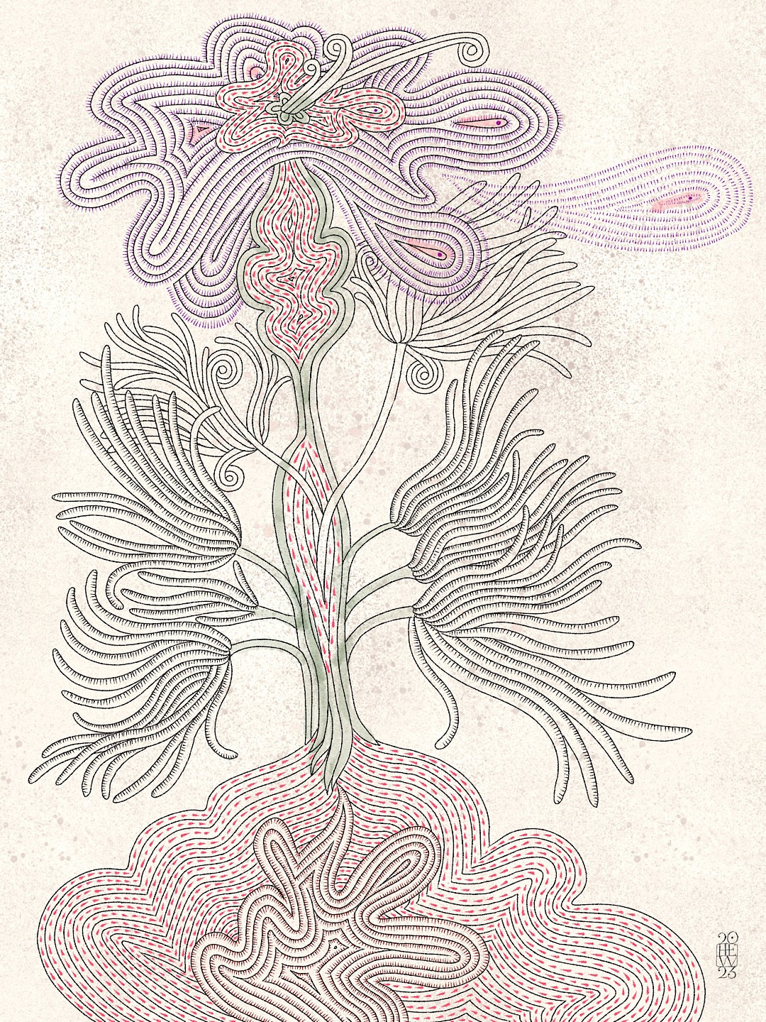
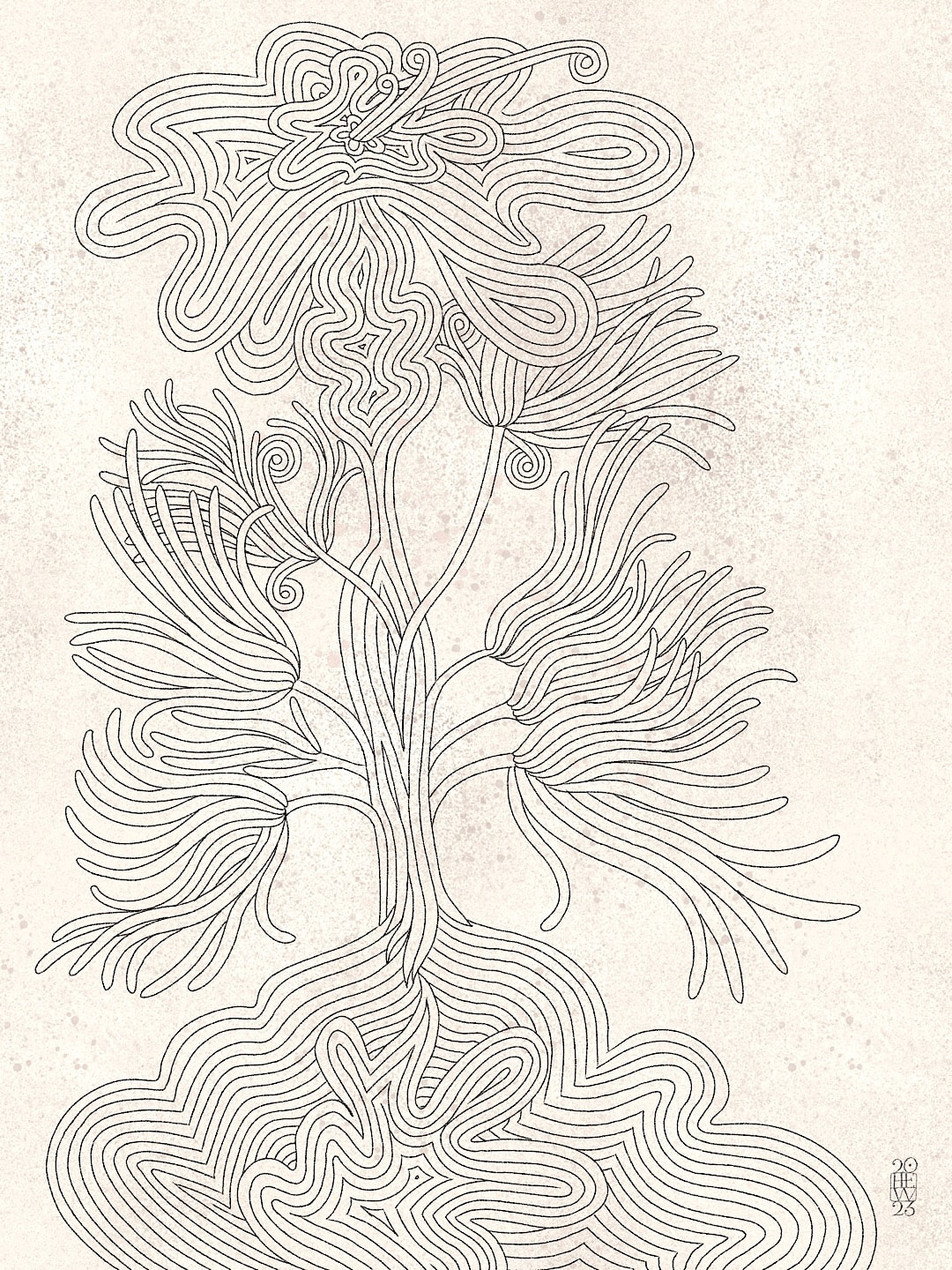
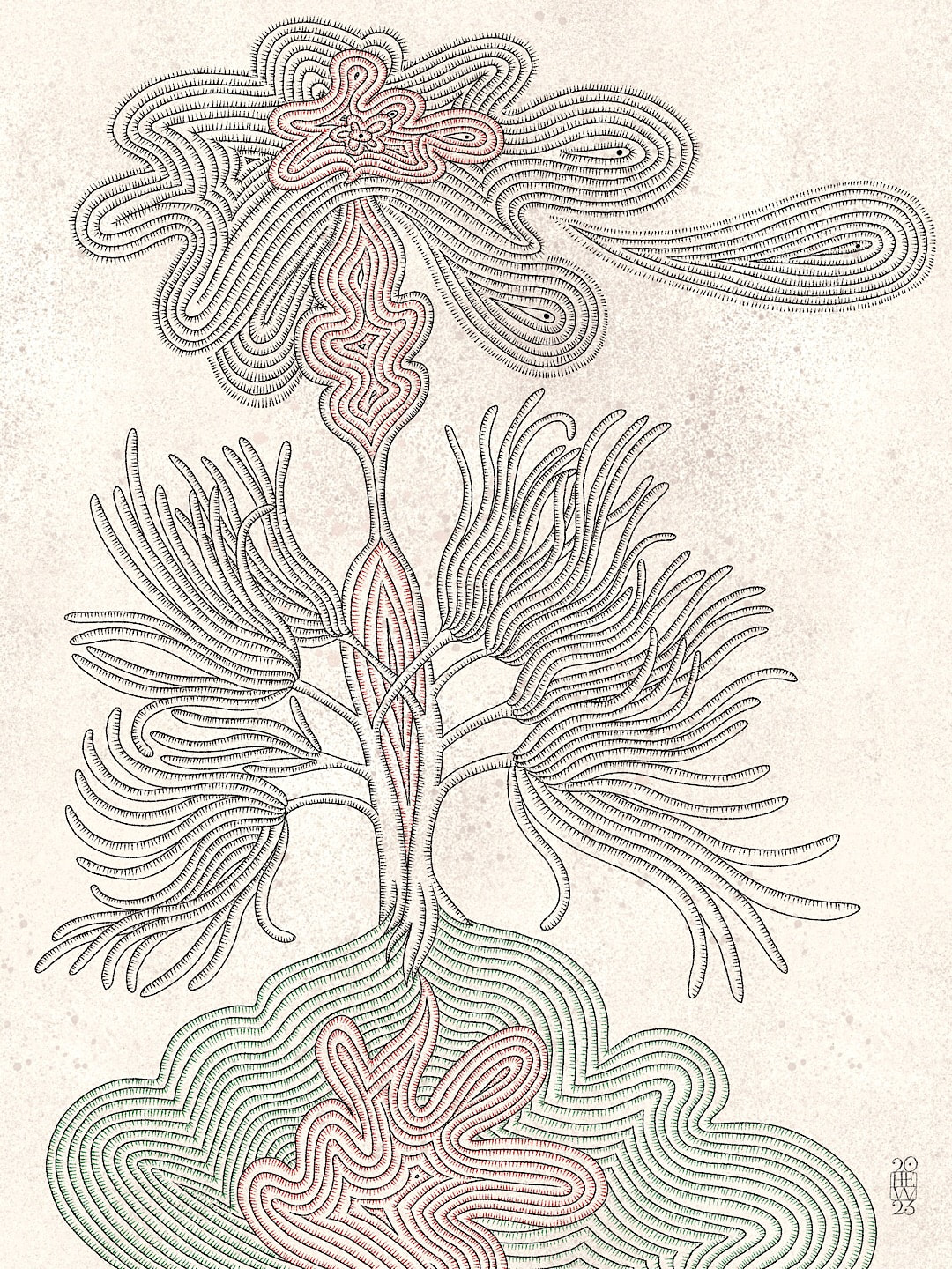
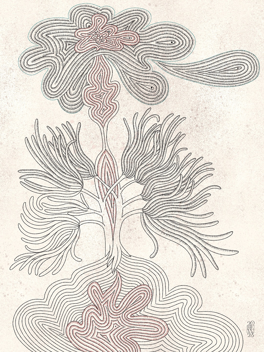
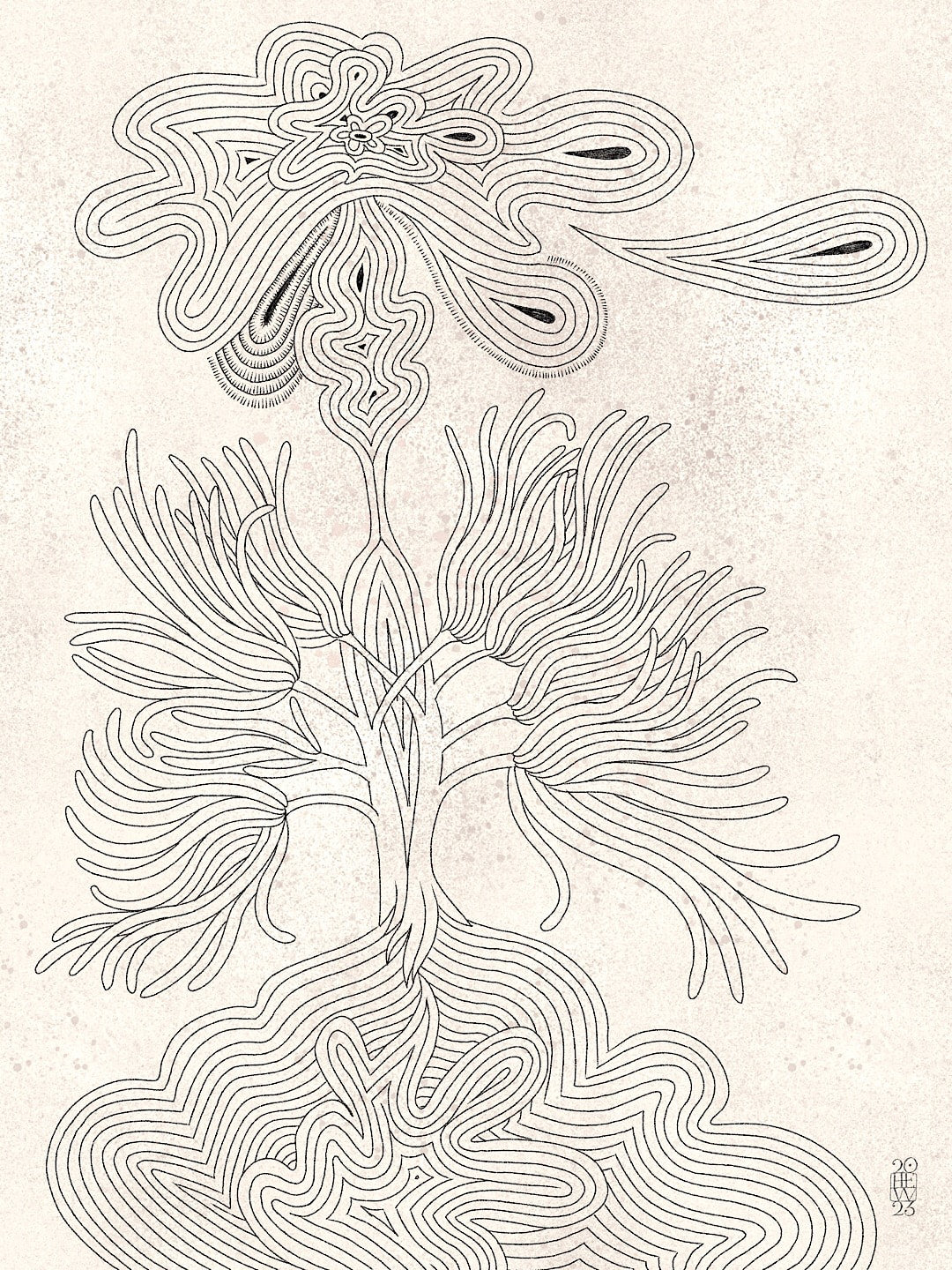
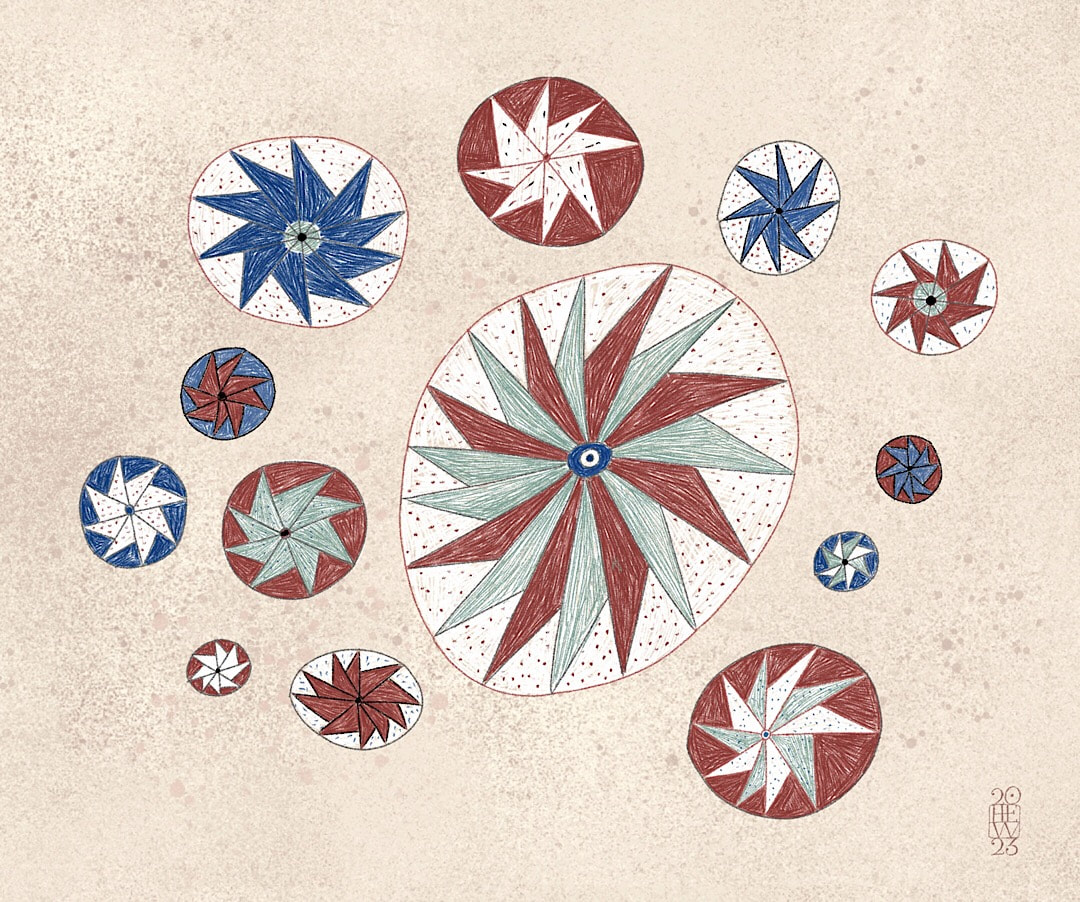
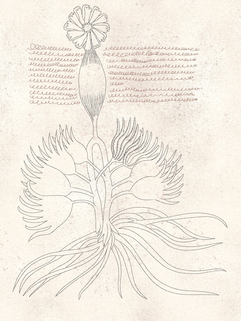
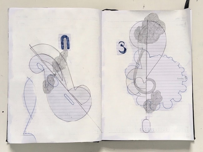
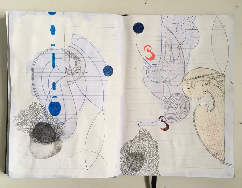
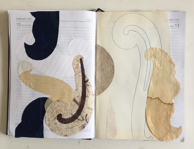
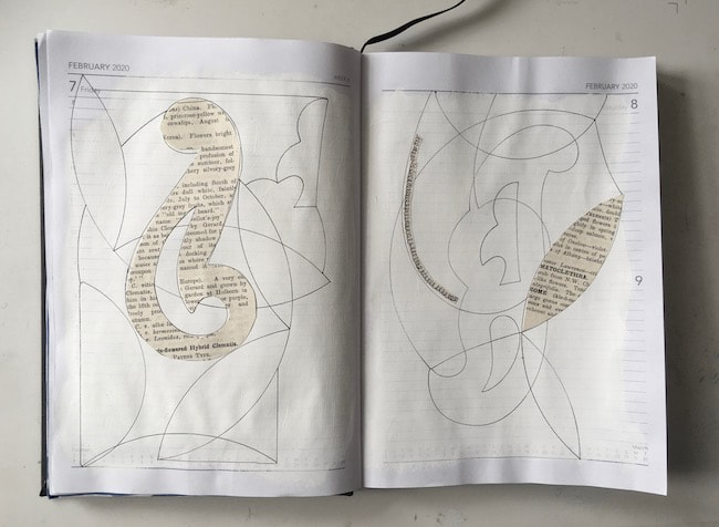
There were several nasturtium plants all winding around each other in the garden photo I've been using as a reference point for drawing, but keeping in mind I want to make a composition of crazy plants in fluted pots I started separating individual stems from last week's tangle. Trying to work out what belongs to what was a fun challenge. I sketched this on my iPad using an 'ink bleed brush' with a variable line weight, but its delicacy and lightness is making me want to draw with real ink and brush, or even a fountain pen on paper!
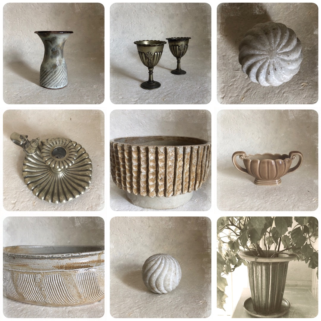
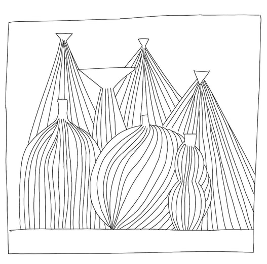
I've been collecting fluted and ribbed items from around the house, looking for suitable pot suggestions for the plants to inhabit in my drawings. From dainty little egg-cups to Indian carvings in marble and sheesham, I am excited by the differing scales; I have an image in my head of tiny pots next to large ones, which I have begun to explore in the above sketch. In the centre image of the collage below, there is a very large old hand-made ceramic pot which has just always been around. The photo doesn't do it justice, as seen here it could easily be a yunomi - but in fact it measures 25cm in diameter.
I've been collecting fluted and ribbed items from around the house, looking for suitable pot suggestions for the plants to inhabit in my drawings. From dainty little egg-cups to Indian carvings in marble and sheesham, I am excited by the differing scales; I have an image in my head of tiny pots next to large ones, which I have begun to explore in the above sketch. In the centre image of the collage below, there is a very large old hand-made ceramic pot which has just always been around. The photo doesn't do it justice, as seen here it could easily be a yunomi - but in fact it measures 25cm in diameter.
I love that pot, but don't know who made it; I remember it originally being in my grandparents' house from the early 1960's when I was a very little girl - so perhaps it was made by a friend of theirs, or maybe a serendipitous junk shop find.


 RSS Feed