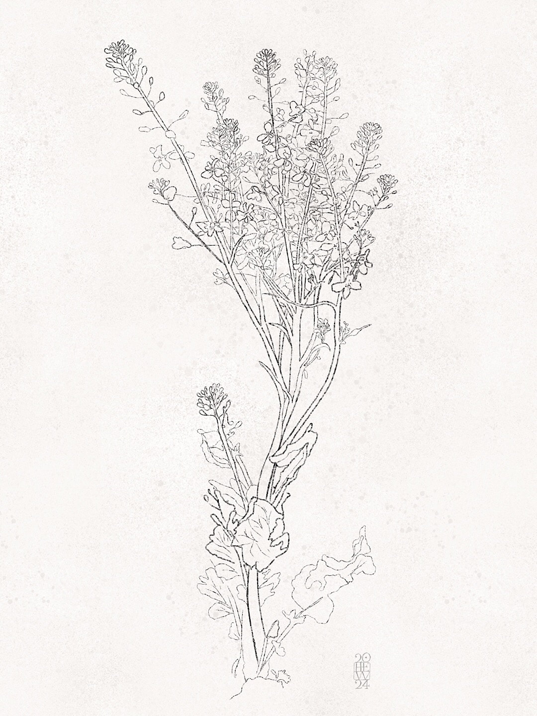
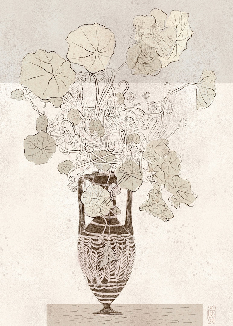
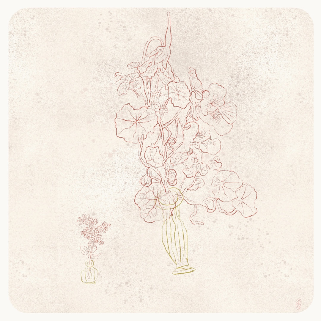
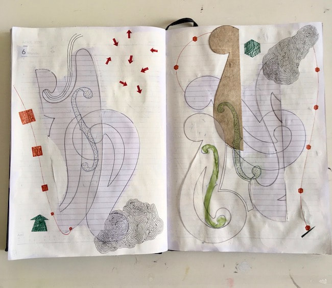
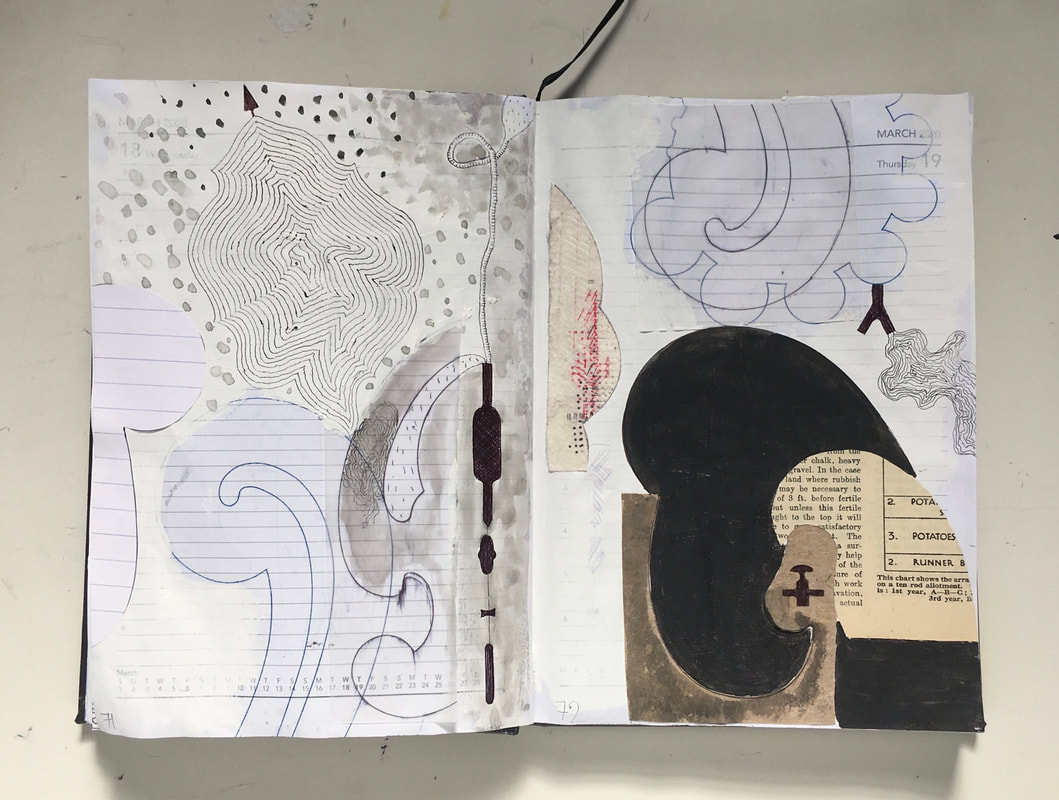
... "of grace and beauty" in bolted purple sprouting broccoli. B allowed two plants to go wild, knowing how much I love to see flowering veg, and they really are beautiful. Of course this sketch doesn't show the colours - deep purple, bright yellow and green set against a bright blue spring sky, but the elegance of those S shapes! 
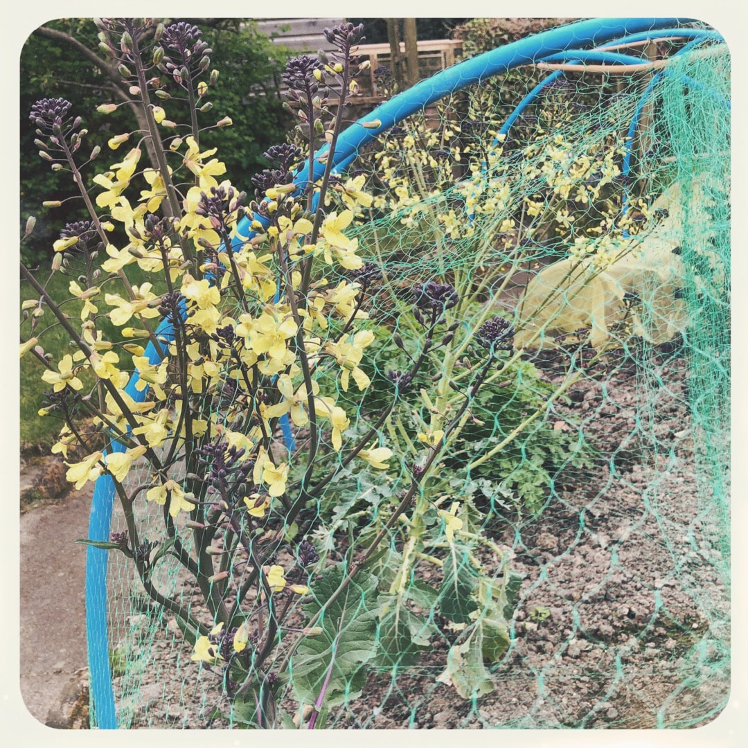
In the foreground is one escaping through the netting, and just behind it where the net has been pulled back for new planting is the one I sketched.
These alabastra have been such a distraction, every one I look at is more fascinating than the rest and I can't resist tracing the feathered movements of the decoration in the glass bodies. This week's one I made into a vase by giving it a little foot, so it can hold a tangle of nasturtiums. I feel it wouldn't be very stable in real life!
I had a bit of a digression this week when having failed to find any fluted pots around the house to draw for my nasturtium tangles, I started an internet search and got totally side-tracked by the beauty of Hellenistic glass alabastra. I thought the intricacy of the feathered patterns, although it doesn't catch the light in the same way as fluted forms, could perhaps work just as well, so I began tracing some on my iPad. While drawing the movement of the molten glass I noticed a the similarity to wheel-thrown pottery in the upwards anti-clockwise spiralling motion. I had to find out more about how the glass bottles were made, so off I went down a fascinating rabbit-hole. A YouTube video by Getty Museum proved most informative (I would never have known the core was formed with a mixture of dung, clay, sand and water!)
It is so true that drawing, even if it's from a photo, helps to reach an understanding of an object in a more thorough way than just looking. I was also interested in the scale and proportions. Alabastra are generally quite small, made to contain perfume, and my drawings are most likely larger than the original objects, so the handles appear larger in comparison to those on a larger vase. Another detangling session later, and I cannot believe the loop-the-loops these plants make! I really couldn't have made it up myself. These mad convolutions seem to happen when the flowerhead withers and drops away to reveal the fruit pod.
There were several nasturtium plants all winding around each other in the garden photo I've been using as a reference point for drawing, but keeping in mind I want to make a composition of crazy plants in fluted pots I started separating individual stems from last week's tangle. Trying to work out what belongs to what was a fun challenge. I sketched this on my iPad using an 'ink bleed brush' with a variable line weight, but its delicacy and lightness is making me want to draw with real ink and brush, or even a fountain pen on paper! I've been collecting fluted and ribbed items from around the house, looking for suitable pot suggestions for the plants to inhabit in my drawings. From dainty little egg-cups to Indian carvings in marble and sheesham, I am excited by the differing scales; I have an image in my head of tiny pots next to large ones, which I have begun to explore in the above sketch. In the centre image of the collage below, there is a very large old hand-made ceramic pot which has just always been around. The photo doesn't do it justice, as seen here it could easily be a yunomi - but in fact it measures 25cm in diameter. I love that pot, but don't know who made it; I remember it originally being in my grandparents' house from the early 1960's when I was a very little girl - so perhaps it was made by a friend of theirs, or maybe a serendipitous junk shop find.
As I worked directly on top of the plant-like elements I had inserted in last week's drawing, I was already replacing them with another idea for wild, manic plants twisting and pushing from fluted pots for the next one. I realised last week's didn't work because there were two different ideas going on in a small drawing: the plant elements were flat and cartoon-like, whereas the fluted forms bear the illusion of three dimensionality - basically, there were two styles of drawing not sitting well together.
This time, with a clear idea of what I want to achieve, I began with a simple line sketch of nasturtiums. It's an idea which began to take root (pun not intended) late last summer, when I photographed fascinating plant activity in some of the weirder areas of the garden - so much stranger and more intriguing than anything I could make up! Truth is stranger than fiction, so this sketch of nasturtiums is based on one of those photos. Above, work in progress. My notes and criticisms can be seen in the margins while I decided this drawing had to be either about the fluted forms, or the wanderings of last week - not both. So I worked directly over the drawing, eradicating which for now is the unwanted wanderings. They will soon come back in another form, where fluted pots and wild plants are in harmony. The ink in an Edding mapping pen (01) was sufficiently dense to cover the drawing made with a Uni Pin 0.05 pen (which, incidentally, got completely used up making this work). The paper is imitation Japanese tissue, inexpensive and good for experiments and tracing, and wrinkles very slightly and delightfully where the marks are dense. So the wanderings of last week have now gone ... I had also been trying to make a 15 x 21cm size drawing from the original notebook sketch; it didn't work (which is why I had wandered and tried adding bits to the drawing to fill the space - it just goes to show you can't fiddle with an original idea). Here it is now looking much happier, the photo cropped down to a proportion closer to the original tiny sketch, only adding a little more dark space above the pots. This part of the sheet now measures 16.5 x 15.5cm.
I also liked the tonality of the notebook sketch, so for the first time I tried out some traditional mark-making using lots of cross-hatching together with the cartoon-style lines I normally use. It's interesting! - quite a range of tone resulted, I like the ghostly effect of the lighter forms against the dark. As I worked I was also thinking of some of my larger drawings with used a dark background, like Before There Were Saturdays. It's important to me right now to create the background with pen rather than painting in a black background, which would have been a lot faster, but wouldn't have had the same movement. I got the printer working (miracle, it's wireless, and will printers ever work first time?) and printed the line drawing I made in Procreate last week. Above is the first stage in pen on semi-opaque paper laid over the print, in my 'portable studio'. The photo looks fuzzy because of shadows cast by the ink drawing over the print. While I was drawing I scribbled a few notes - the foreground pot reminded me of the legs on Gormley's Angel of the North in Gateshead, and I also began to think of umbrellas and other pleated forms. Progress stages above show, top left, a digital version with blacked out background, closely following the original sketch. Top right shows starting to fill the drawing with shading; bottom left shows shading of the outline complete, and the right hand side is just where I wandered with it afterwards. I let it go, although it wasn't what I intended; I wanted to reproduce the original notebook sketch on a larger scale and I'm not sure about the added elements coming from the pots - I had intended focusing on the fluted forms. I'll keep going with this one, though, then perhaps begin again another drawing sticking to the plan.
Dawn Chorus was the first drawing I finished for the Christmas exhibition at the Open Eye Gallery in Edinburgh. The paper is a Japanese printing tissue, which is a delicate-looking semi-transparent material which also happens to be strong.
First, I laid down textures of printing inks in sepia and indigo, drawing around some of my Dad's old architectural forms. Once that was thoroughly dried and set, I used mapping pens to draw clouds and shapes and vapours. I then added hand stitching using red domestic cotton and black upholstery thread salvaged from bobbin-winding at work. The whole effect is floating and peaceful, making me think of winter or autumn day-break. The shapes in the upper half of the picture are how I imagined bird-song to be notated; not the mad lustiness of the spring and summer chorus, but rather the sort of meditative tootling and twittering small birds make at that time of year. On a Small Scale exhibition will be available to view and purchase exclusively online on the Open Eye Gallery's website during November and December. All works in the exhibition are 15 x 21cm, either portrait or landscape format. My thumb is already so much better that I have been able to set to work on my drawings this week. It is so good to be working on paper again. I have been collecting ideas and elements digitally in Procreate on my iPad for months, and now it is great to be actually drawing out those forms - challenging at times, switching up my drawing techniques for the good! For example, the star shape seen to the lower right of the photo above was fashioned easily with the aid of digital streamlining tools. I now had to work it by hand using a ruler with a precision which I found daunting. I procrastinated making the physical version horribly, but actually enjoyed the work when eventually I plucked up the courage to get on with it. Just beginning to sew stitching into the paper in this photo. I like the awkwardness about it, I can't quite control where the thread is going to wander using strange media like Japanese tissue instead of fabric, but I like surprises!
So now the work for the On a Small Scale Christmas exhibition at Open Eye Gallery Edinburgh is under way, and it is exciting melding together digital explorations, my day-job as upholsterer seamstress and fitter, and my drawing techniques. Talk about transferrable skills. I began making a 'Giant 9' for Instagram and realised the upper leaves and centre of the flower had yet to be filled with shading, so here it is now in its full finished glory (see the unfinished version here).
I enjoy my blog here, it's a record of my work I would be unlikely to keep so well. But I'm not very regular with my IG posts. Like many other artists I find social media disturbing and would rather not use it, but I have to ask myself, what is the point in making all this work if I don't show it anywhere? So, soldier on with Instagram I shall. The photo I posted last weekend of the shadow cast by a wrought iron table in our garden interested me so much I couldn't resist drawing it: the tilt and strange perspective, shadows on the patio, and lichen patterns wandering across stony textures proved irresistible to my mind. The table is one I designed for my shop back in the '90s, a prototype for the Provençal range of dining furniture hand-forged by Stan Pike which became a best seller for the business (and also got ripped off by someone photographing the window display, and copies turned up later in Prague). I didn't have the prototype powder-coated, and it wasn't designed to be outside so mine has rusted in the garden, expressed by the brown colour in the drawing above. The finished dining sets were available finished in a clear coat to show the beauty of the natural metal, or in customised funky colours to suit clients' interior design specs.
It felt strangely familiar when I was drawing its shadow, and I thought it would be interesting to show my original artist's impression of the design for the forge, but unfortunately I couldn't find it in time before posting today - if I come across it I'll post it next week. Summer has suddenly arrived with warm weather and enough rain to give us a lot of work in the garden. B built a lovely big raised bed for veg last week to add to his vegetable patch, and we are spending a lot of time outdoors while the weather is good. My full time job is very busy at the moment, too - so not a lot of time left for artwork, but here is a very quick sketch of some indoor gardening - sprouting seeds. Alfalfa sprouts are so delicious in a sandwich, I was delighted when we found some seeds in our local garden centre and B got to work on them. He grew some in soil which produced tasty little cress-like greens, but these seeds are in a jar of water, rinsed with fresh water every day and kept in a dark drawer to magically come to life. Swimming about in fluid, these sprouts do indeed look like the very beginnings of life.
This is how the Voynich-type plant drawing, begun in April, is growing. It has come quite a way since Virginia Woolf provided my first inspiration for describing the notion of part earth, part flower, and my first few lines exploring a Voynich Manuscript plant as a springboard for the work. The cyan-coloured line around the flower-head, seen in the image above, is actually just a guide I drew for a fringed surround. The detail on the left below shows it without the guide line; the right-hand image is without any lines at all - I am always intrigued by the airy, ethereal little marks which come together to make a whole. One day I want to make a whole drawing just like that, but for now the method may help make some good 'aromas' for my Neruda's boats work. This demonstrates how useful I find it to use my iPad as a tool not just for creating work which would make good prints, but also as a space for experimenting and testing new ideas for work on paper. Each element is on its own layer, so the visibility can be toggled on and off: a good thing for this drawing, because I have a few different ideas for dealing with the earth element in the lower section. I may eventually leave the plain linear form as it is, but I will definitely be trying out a few other things in layers to see what appears.
The new style 'lights', or star shapes, are looking good now. Here they are sitting in my Dad's yacht plan drawing as part of my Neruda's boats project; a little boat carrying lights. I'm taking some time here to admire some simple, elegant geometry: these two images are guides for pattern designs I made to produce nice, flowing ogees. Made without much in the way of tools, I have written a bit about the process over on my Binky blog.
|
Welcome to my work journal - a weekly update on drawings, work in progress, doodles and day-dreaming.
I changed the website address a few months ago, so some older links on previous posts are broken. If you click one of those and it takes you to a strange page, simply replace the .co.uk after the heatherelizawalker. with weebly.com and it will work again. <<<<<<<<<<<<<<<<<<
<<<<<<<<<<<<<<<<
>>>>>>>>>>>>>>>>
As well as the work you see here, I illustrate under the name of Binky McKee (my mother's maiden name was McKee, Binky was every single one of my great grandmother's many cats!)
If you would like to visit my Binky website, please click the picture above. <<<<<<<<<<<<<<<<
Dissolving PeopleA symbol on the footpath outside a local primary school gradually disappearing as the image breaks up and wears away until eventually it is obliterated by leaves and barely discernible. Photographed at intervals of several months between February 2021 and November 2022, oldest at the top.
(My shoes look so new in the first pic, and note the transition to new phone in the last photo). <<<<<<<<<<<<<<<<
<<<<<<<<<<<<<<<<<<<
All
<<<<<<<<<<<<<<<<
<<<<<<<<<<<<<<<<<<<
April 2024
(Sorry the archives don't nest!)
<<<<<<<<<<<<<<<<
>>>>>>>>>>>>>>>>
A 2013 work book, still very much in use Please note all images on this website are ©Heather Eliza Walker 2013 - 2020, and may not be used or reproduced without prior consent. |