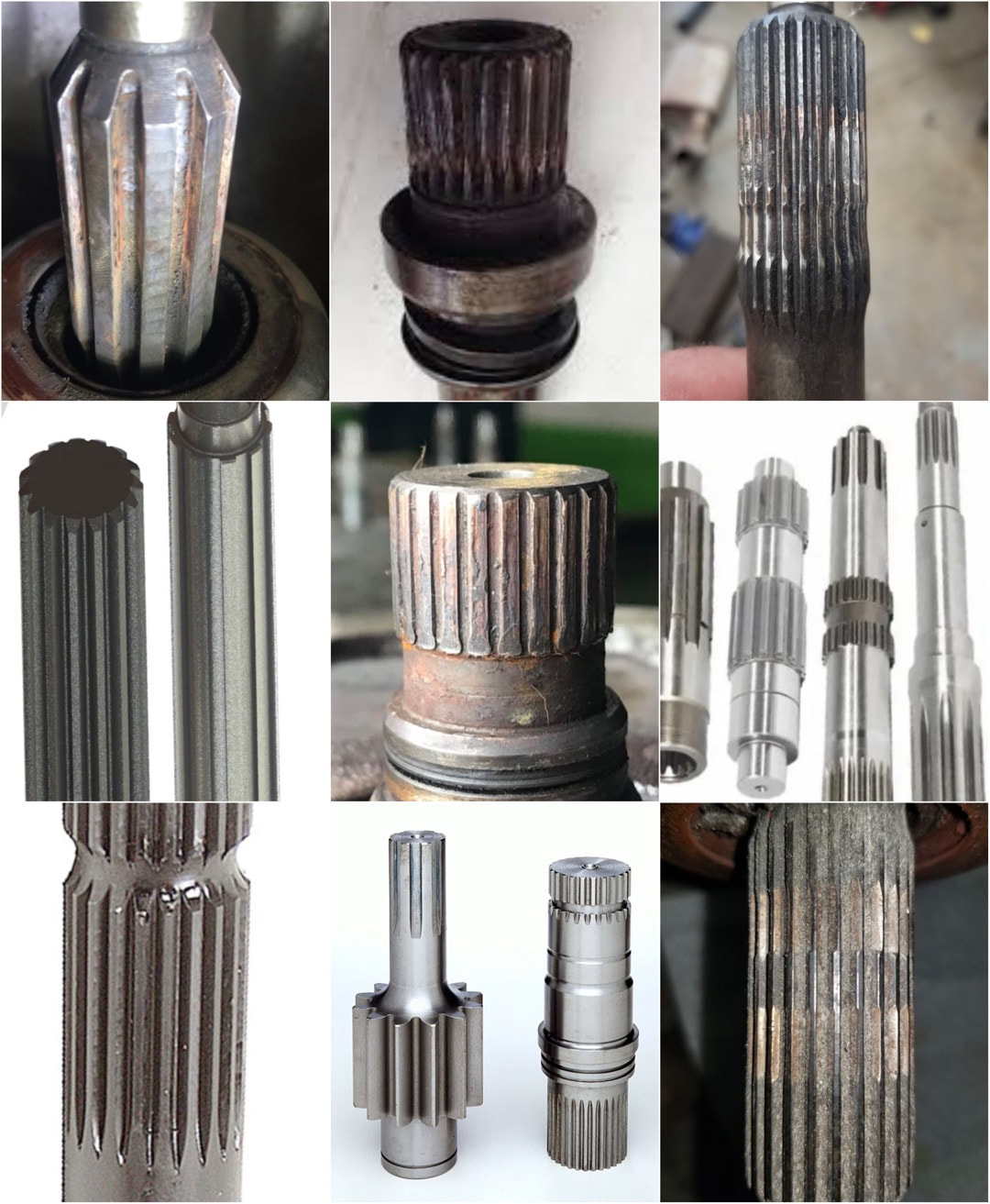
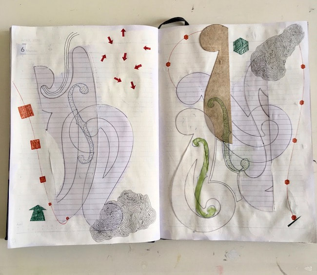
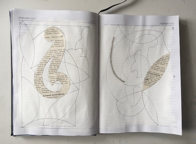
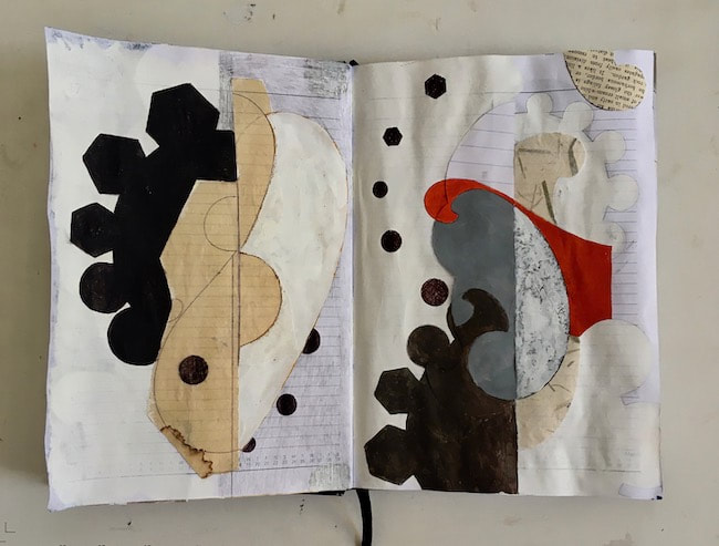
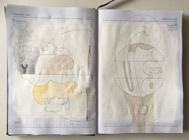
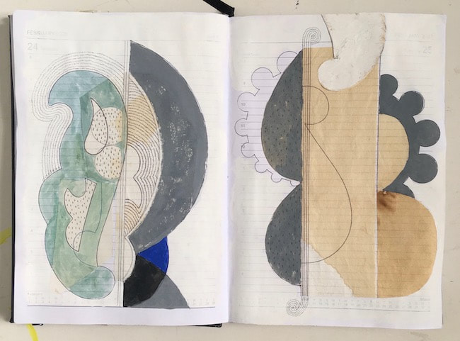
Still looking for ideas to make into fluted or finned pots for the nasturtium drawings, I wasn't turning up much at all. Then I was doodling away while B was watching car repair videos on YouTube and saw a splined shaft on Shed Racing. A Google search later produced lots of interesting shapes! So here is a sketch inspired by - drive shafts. It would appear I was looking in the wrong places for what I had in mind! 
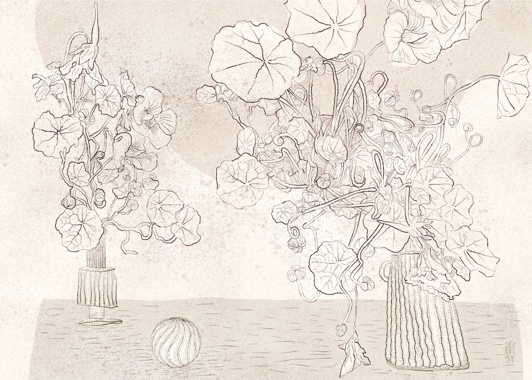
The way splines catch the light was exactly the idea I had in my head, so I made this quick sketch on iPad.
I had a bit of a digression this week when having failed to find any fluted pots around the house to draw for my nasturtium tangles, I started an internet search and got totally side-tracked by the beauty of Hellenistic glass alabastra. I thought the intricacy of the feathered patterns, although it doesn't catch the light in the same way as fluted forms, could perhaps work just as well, so I began tracing some on my iPad. While drawing the movement of the molten glass I noticed a the similarity to wheel-thrown pottery in the upwards anti-clockwise spiralling motion. I had to find out more about how the glass bottles were made, so off I went down a fascinating rabbit-hole. A YouTube video by Getty Museum proved most informative (I would never have known the core was formed with a mixture of dung, clay, sand and water!)
It is so true that drawing, even if it's from a photo, helps to reach an understanding of an object in a more thorough way than just looking. I was also interested in the scale and proportions. Alabastra are generally quite small, made to contain perfume, and my drawings are most likely larger than the original objects, so the handles appear larger in comparison to those on a larger vase. On Wednesday morning, reading Maria Popova's The Marginalian mid week pick-me-up newsletter, I came across this lovely account of one of Virginia Woolf's earliest memories of being in the garden by the large white house on the Celtic Sea coast where she grew up: "I was looking at the flower bed by the front door; “That is the whole”, I said. I was looking at a plant with a spread of leaves; and it seemed suddenly plain that the flower itself was a part of the earth; that a ring enclosed what was the flower; and that was the real flower; part earth; part flower." Some of my earliest memories are also of the garden in Rosyth belonging to a sturdy house where my parents lived from when I was about 4 years old. One day I remarked to my mother on the way home from school, observing a hawthorn hedge with its writhing branches springing from the earth on the way home: "Mummy, we live in the roots of the world." There was a very large privet hedge in our garden (I was very small at the time, it probably wasn't as huge as I recall) into which I would secretly creep and explore the roots and low branches in the spaces before the leaves grew. I was suddenly aware that the hawthorn had the same low spaces connected directly to the earth. My parents had a vegetable patch in the garden, which I also inhabited at roots level, full of wonder at how summer flowers somehow gave way to large ruddy beetroots and cabbages and beans later in the year. When I grew older I began to feel I could actually experience and somehow see the energy of sap rising high into trees, the same life-force of nature I strive to convey in my drawings through repeated lines emanating from stems into leaves and flowers.
Virginia Woolf's The Waves left a lasting impression in my mind, I think a revisit is in order (it has been many years since I read the book). Maria Popova's quote got me thinking about combining drawings I made last year from the weird and wonderful Voynich manuscript with my recent ice-inspired sea monsters. They are very rooty looking and make me think of carrots, parsnips, and other root vegetables and flowering herbs. Two years ago I discovered Polynesian navigation stick charts and became absolutely fascinated with them. I made a number of quick sketches of different charts at the time on my iPad and played around with them, sometimes combining charts, and placing them against various backgrounds. They weren't resolved in any way, full of digital wobble and not really that good (see February 2021 blog entry). My interest in the subject hasn't waned since, and this week I revisited the drawings in the light of my recent nautical themes. I redrew them (neatly this time!) using the same method as last week's tracing of my Dad's yacht plans; the image above shows four different combinations of chart drawings overlaid on each other. I have actually now answered my own question from two years ago - I decided against keeping the 'digiwobbles', as I called the digital shaky line. I either ignored or hadn't yet discovered the streamline adjustment on Procreate's tools, but kind of liked the wobble at the time. Now I'm going straight, so to speak. A much better result this time, in tune with my current aesthetic. As I drew each one I tried to imagine what the lines meant. I don't understand how to read the charts at all, I simply admire their elegance and arcane relationship with sea, canoe, waves and sky. Apparently only the maker of each chart knew how to interpret it. I understand from a little reading on the subject that the curved lines seem to represent swells in the sea, and the intersections mark the position of the Marshall Islands in the Pacific Ocean. Shells were often tied to the sticks to mark the positions of islands, and gauge the distance from a canoe; prevailing winds and currents of the seas are also somehow indicated. I don't think I want to know much more than that, it might spoil the poetry of the charts, and I'm not sure exactly how much information is available on the subject anyway given that only the maker of the chart could use it. I have a feeling the charts' meanings may have been closely guarded secrets.
The images here are experiments drawn on my iPad, feeling my way through the subject and exploring how I can express the charts' relationships with the wilderness of ocean through which they guided men in nothing but small canoes. This week I worked on a lot of stock for big recliner chairs in Edinburgh, which meant drawing out for more lugs (my favourite templates). This time I was able to take a few quick photos, with permission, after drawing around templates onto the back of vinyl fabric for the chairs before I cut them out and sewed them up. My fabric drawings are much less complex and very rough in comparison to my Dad's drawings I posted last week, but this is what puts me in mind of my his yacht plans. The spaces in between the elements which make up the lugs can be seen here, the same as the offcuts I kept for my Neruda's Boats project last month. After taking pictures of Dad's yacht drawings last week, I wondered what drawings for a huge cruise ship would look like. A Google search readily turned up these marvellous drawings by Kevin Hulsey on his Automotive Illustrations website amongst a wealth of cutaway drawings of cars and a number of other machines by him ... ... including an illustration of an MRI scanner which I found interesting. I had an MRI scan a few weeks ago for the first time. The scanner into which I was inserted was somewhat longer than the one in the illustration below, being, I suppose, designed for full body scans, but it looked pretty much the same. I was careful to remove all metal objects from my body beforehand as per the NHS instructions leaflet, and was very glad I had done so when afterwards I watched a YouTube video showing metal objects, including a whole computer chair, being pulled into an MRI scanner by its strong magnets! I can't believe my body was actually inside one of those things, nor can I say it was altogether an unpleasant experience - weirdly relaxing, in fact, rather like being at a modular synthesiser concert wearing headphones, with lots of bleeps and whirring and knockings, plus a sudden strangely disjointed Scottish voice at intervals telling me to hold my breath.
Visit Kevin Hulsey's website here for more car photos and beautiful industrial illustration. These beautiful little cards I discovered on Pinterest years ago have been a source of inspiration and curiosity to me for some time. I have never really known anything about them, I just assumed they were some form of obscure renaissance folk-art. Pinterest being what it is, found images seldom come with information, but I turned up a few more of these yesterday and one was titled 'Robert Coutelas'. Eager to learn more, I Googled Robert Coutelas and turned up nothing - until I went to Japan (virtually, of course). An exhibition of Robert Coutelas' work was held in Tokyo in 2016, which seems to have made quite an impression in Japan. There is a super website at robert-coutelas.com with luscious, high quality photos by Isao Hirachi of Coutelas' work (it was odd the website didn't pop up first in my search). I can't read Japanese, so I was none the wiser about the man behind the work at this point, but after some further digging I found out a bit more ...
I came across this panel in B's painting shed the other day, on the back of one of his paint tests. He makes his own paint, and tests the colours in swatches painted on small gessoed boards on stretchers. The swatch was facing the wall, revealing this small abandoned painting, scraped off, turned over and repurposed, with the stretcher now forming a deep frame around the picture. I would actually hang it on the wall just as it is. I love the texture and colours, and at some time soon I think this may form a background to an illustration. An update on my avocado roots this week - they could really do with being potted now as the leaves are beginning to look sad, no doubt lacking nutrients. See their development since February here and right at the beginning in July last year here ... I can't believe the force of nature hidden in the stones. The jar in the centre's stone split in half, leaving just what's showing above.
I was looking for a completely different tome in my bookcases this week when I came across this delightful little book I had forgotten all about. I bought the book for B's birthday years ago because he is very much a shed man. At the time I loved it because it was quirky and about sheds, but now, having fully developed my drawing style, I appreciate it all the more. Each of Nigel Peake's detailed drawings has its own creative charge, for instance this shed balanced on unfeasibly delicate legs. I didn't want to scan too many images for fear of spoiling the binding by flattening the book, but the back cover shows beautiful little slices of colour which appear in some of the drawings. It's no surprise that Nigel Peake studied architecture at the University of Edinburgh. The book drawings were made in 2006-2007 when Nigel was only 26 years old. The playfulness of a young enquiring mind inhabits an astonishingly mature style. The ingredients of a shed: nails, timber, felt, slate, stone and rust - what a wonderfully inspiring collection of materials. It's a great book for dipping in and out, it was a lovely rediscovery and I have passed some enjoyable times with it this week allowing my eyes to ramble through the stories of each shed.
Here is something from my botanical Pinterest collection. As is often the case with Pinterest, no information is provided about the engraving, but I guess it's about cell formation in plants. I did find related engravings on BibliOdyssey posted by Peacay on 2 June 2011 consisting of beautiful botanical micro-anatomy plates from Anatomia Vegetal by Frederick Elfving. (I can't provide a link directly to the entry because I couldn't find it in the blog archives and the entry's url is locked). It is a very interesting blog altogether.
I can't help thinking of beautiful curtains when I look at this engraving! In my childhood my Dad (leading draughtsman and architect) would encourage me to deconstruct boxes, carefully folding them out to see their flattened shapes. It is a practice I have continued ever since with undying fascination, so I was particularly interested in this collage/drawing by Eva Hesse which reminded me of those shapes. Below are two paintings on paper of cisterns by my partner Bernard. He has them hanging in his work shed, and when I was there the other day after seeing Eva Hesse's drawing I was struck by the nice relationship they all have and how they talk to one another. I came across Eva Hesse's drawing online: Forms Larger and Bolder, an exhibition of a selection of her early drawings held at Allen Memorial Art Museum (Oberlin, Ohio) last month.
A friend said one of my drawings had 'an Italo Calvino vibe', and never having heard of Calvino, I Googled. The pitfalls of casual googling were evident when I assumed the drawings I saw on my search results were by Calvino. Then I noticed there were a few different styles of drawing, clearly not all by the same person. I looked into it and discovered Calvino is in fact an author. His book Invisible Cities has inspired several artists to make work based on each city's story; the ones shown here are by Peruvian architect Karina Puente (first to come up on a Google search on Italo Calvino) - my favourites by a mile. Whether my friend, as I did, thought the drawings were by Italo Calvino, or whether she was referring to the spirit of the book in relation to my work, I don't know. She may even have been referring to some of the book jacket designs on Calvino's books. I haven't read Invisible Cities but took a 'look inside' on Amazon and I love what it is, not quite a novel as such, but a collection of descriptions of experiences in imaginary cities. Each city has a personality which is explored, I assume it's no coincidence that many have been given human names. The poetry of Calvino's writing displays a clarity of vision, obviously the reason so many artists have been inspired by it. The book is on my list for Santa this year.
Please check out the beautiful work of Karina Puente on her website - prints are available to buy on her shop. Besides being an architect and illustrator, she is a self-taught ceramicist and there is also a selection of her works in clay which look like objects discovered in an archeological dig on Contemporary Vestiges. Also on my list for Santa. I came across this drawing when I was looking for something else a few weeks ago. I was quite taken with it, put it on my iPad and flipped it vertically because it looked like some peculiar landscape. I liked the mysterious letters, all the more so for being flipped. It has stayed on my iPad ever since, waiting to be explained. After flipping it back the right way the other day, I saw it reads "Neurons in the cat brain illustrated by Cajal" and my curiosity was aroused; I felt I must know more about this Cajal.
I found there is a book of Cajal's drawings, The Beautiful Brain on Google Books: "These drawings are explored from multiple perspectives: Larry W. Swanson describes Cajal’s contributions to neuroscience; Lyndel King and Eric Himmel explore his artistic roots and achievement; Eric A. Newman provides commentary on the drawings; and Janet M. Dubinsky describes contemporary neuroscience imaging techniques." It's fascinating how different approaches reveal completely different aspects of a thing. The book is a little out of my price-range at the moment, but I'm happy with my own flipped perspective and how it seems to talk to my pizza stone, below. This week I discovered the beautiful paintings of Croatian artist Aleksandar Bezinovoć on Instagram. Not only the paintings, but his concerns are interesting; he writes "... It draws on Platonic thought: the beauty of the form is in the regular figures of the circle, of the square, of the hexagon. His photos of architectural structures and details reflect this interest, and I spotted this photo he had posted of a floor mosaic in the Basilica of Santa Maria e San Donato, Venice. Such a perfect knot tempered by the textures and colours of the tiny tesserae! It immediately made me think of my comet drawings from a couple of years ago - rather wonky compared in the face of 'regular form'. They originated in drawings I was making of empty buildings, like elaborate swimming pools, which were covered in tile work and mosaics (they predate this journal, but I'll dig out an example to post on this blog).
I had related my knots, which I made into comets in a few works, to something close to home: the Scottish Celtic knot. I had no idea it was a widespread symbol, although I am sure the fascination with interwoven bands exists anywhere in the world where curious humans live and is not restricted to my native land! Perhaps something from Art History lectures at Edinburgh University in the late 1970s rubbed off. By the way, apologies if you visited this page before there was any writing here; I had begun the post when all of a sudden dinner was ready and I had to go and eat. Yum. We have the most beautiful big snowdrops in our garden. I think my mother may have planted them years ago, or perhaps they just sprang up wild and multiplied; the woodlands in the area are full of them, too, so it's a possibility. However, we are blessed with them and they are much admired by our neighbours.
This week saw Candlemas on Wednesday. I always pick a few snowdrops from the garden to bring inside for Candlemas, they are such a joyful celebration of the spring to come it is a real blessing to have them around. I always feel a bit guilty about picking them, but there are plenty more outside and when the snow and ice comes they get spoiled. Our house is quite cold, so they keep well for a long time in water. It's never until they are arranged in a small vase that the inner beauty of their centres can be seen properly; their heads are bowed so modestly, it's even hard to get a photo of them indoors - here they are on the windowsill, still looking very shy. For the first time in my life I have managed to get avocado stones to sprout. In the past I used the cocktail sticks/ jar of water standing on a sunny windowsill method to absolutely no avail, but a couple of months ago Molly told me she had successfully sprouted one by wrapping a peeled stone in wet kitchen roll, sealing it up in a plastic box, and simply leaving it for 6 weeks. I used this method for three avocado stones, of which only one failed. At the same time I tried two with the cocktail stick/windowsill method, of which one has sprouted! I must be growing green fingers. It's the most fascinating thing to observe, below is a sketch I drew in wonder yesterday. Until now, I have never seen a rooting and sprouting avocado stone but there is an uncanny resemblance to my drawing Before There Were Saturdays . Flushed with success, I have been telling my friends all about it - with mixed reactions. My 'second brother' (oldest and best friend since I was 11 years old) in Germany said, "My flatmate in Edinburgh used to do that. You know, darling, they make very boring plants with just great big ugly leaves that do nothing". He grows marvellous, glamorous orchids which probably explains his opinion.
My other best friend in London, who it turns out has been making avocado plants this way for years and is currently sprouting lichee stones just by putting them in water, exclaimed with great enthusiasm: "Oh yes! How wonderful, they grow into lovely plants with lovely great big leaves!" |
Welcome to my work journal - a weekly update on drawings, work in progress, doodles and day-dreaming.
I changed the website address a few months ago, so some older links on previous posts are broken. If you click one of those and it takes you to a strange page, simply replace the .co.uk after the heatherelizawalker. with weebly.com and it will work again. <<<<<<<<<<<<<<<<<<
<<<<<<<<<<<<<<<<
>>>>>>>>>>>>>>>>
As well as the work you see here, I illustrate under the name of Binky McKee (my mother's maiden name was McKee, Binky was every single one of my great grandmother's many cats!)
If you would like to visit my Binky website, please click the picture above. <<<<<<<<<<<<<<<<
Dissolving PeopleA symbol on the footpath outside a local primary school gradually disappearing as the image breaks up and wears away until eventually it is obliterated by leaves and barely discernible. Photographed at intervals of several months between February 2021 and November 2022, oldest at the top.
(My shoes look so new in the first pic, and note the transition to new phone in the last photo). <<<<<<<<<<<<<<<<
<<<<<<<<<<<<<<<<<<<
All
<<<<<<<<<<<<<<<<
<<<<<<<<<<<<<<<<<<<
April 2024
(Sorry the archives don't nest!)
<<<<<<<<<<<<<<<<
>>>>>>>>>>>>>>>>
A 2013 work book, still very much in use Please note all images on this website are ©Heather Eliza Walker 2013 - 2020, and may not be used or reproduced without prior consent. |