Another advantage to working digitally in that I can still explore ideas and work in poor light. I should have organised all of this in the winter months, but it's still useful even now when the days are drawing out and lengthening with the promise of spring approaching; the evenings are still dark, and my work room is still very cold.
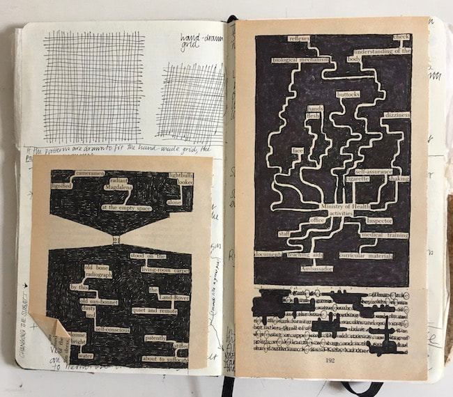
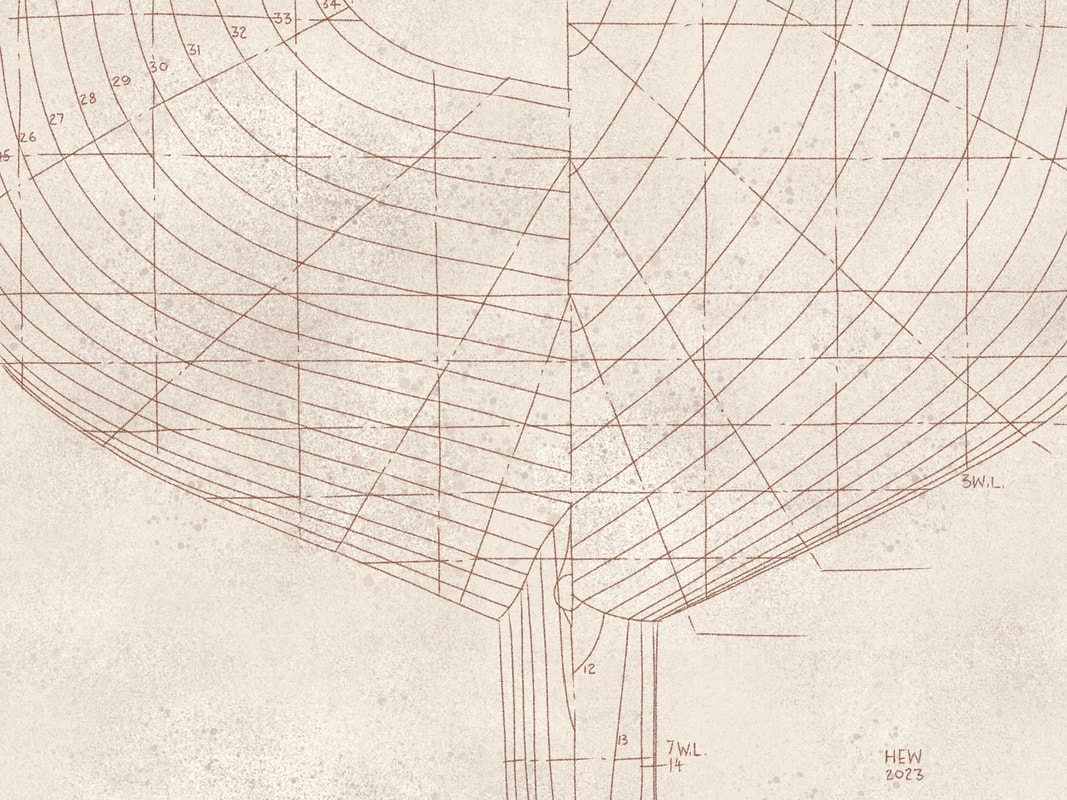
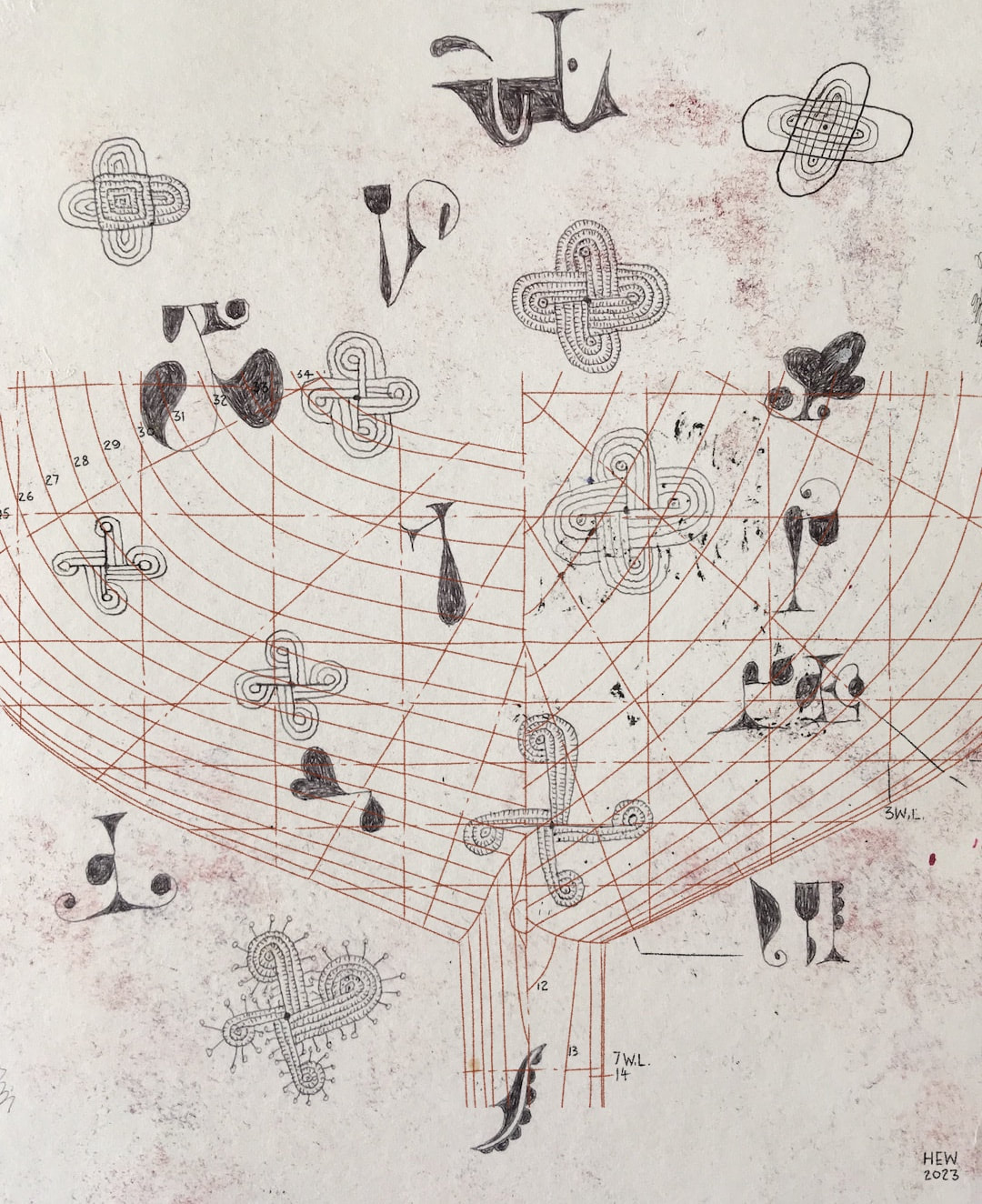
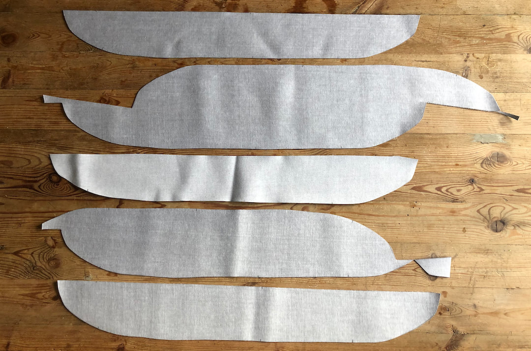
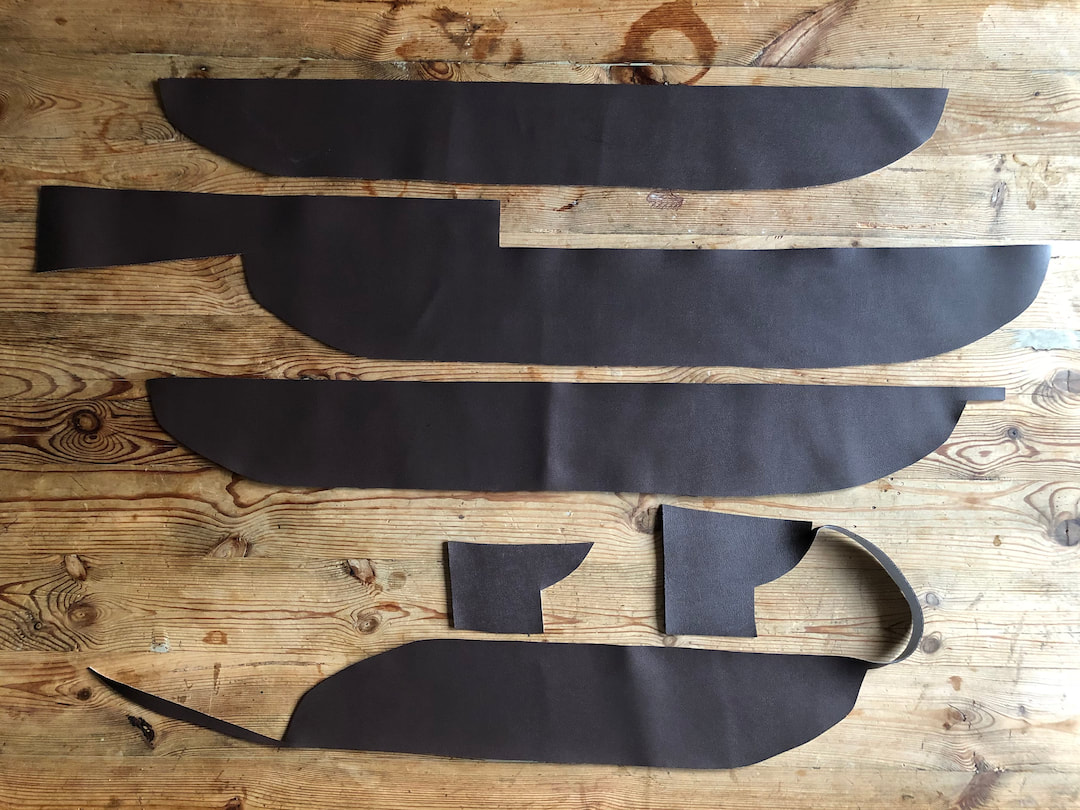
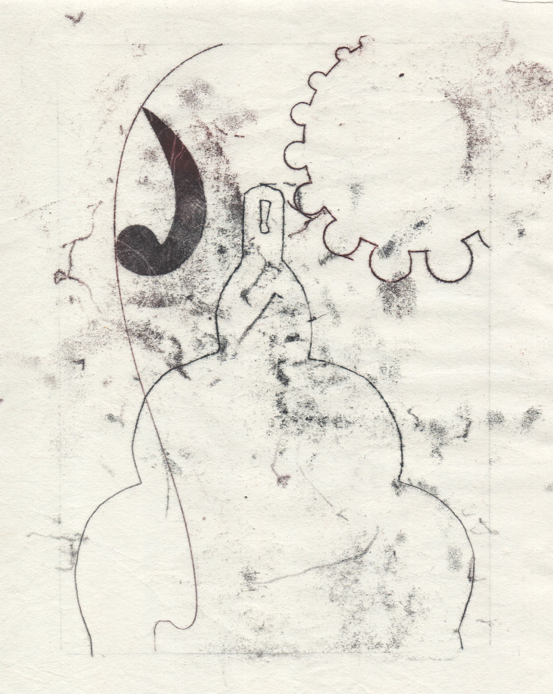
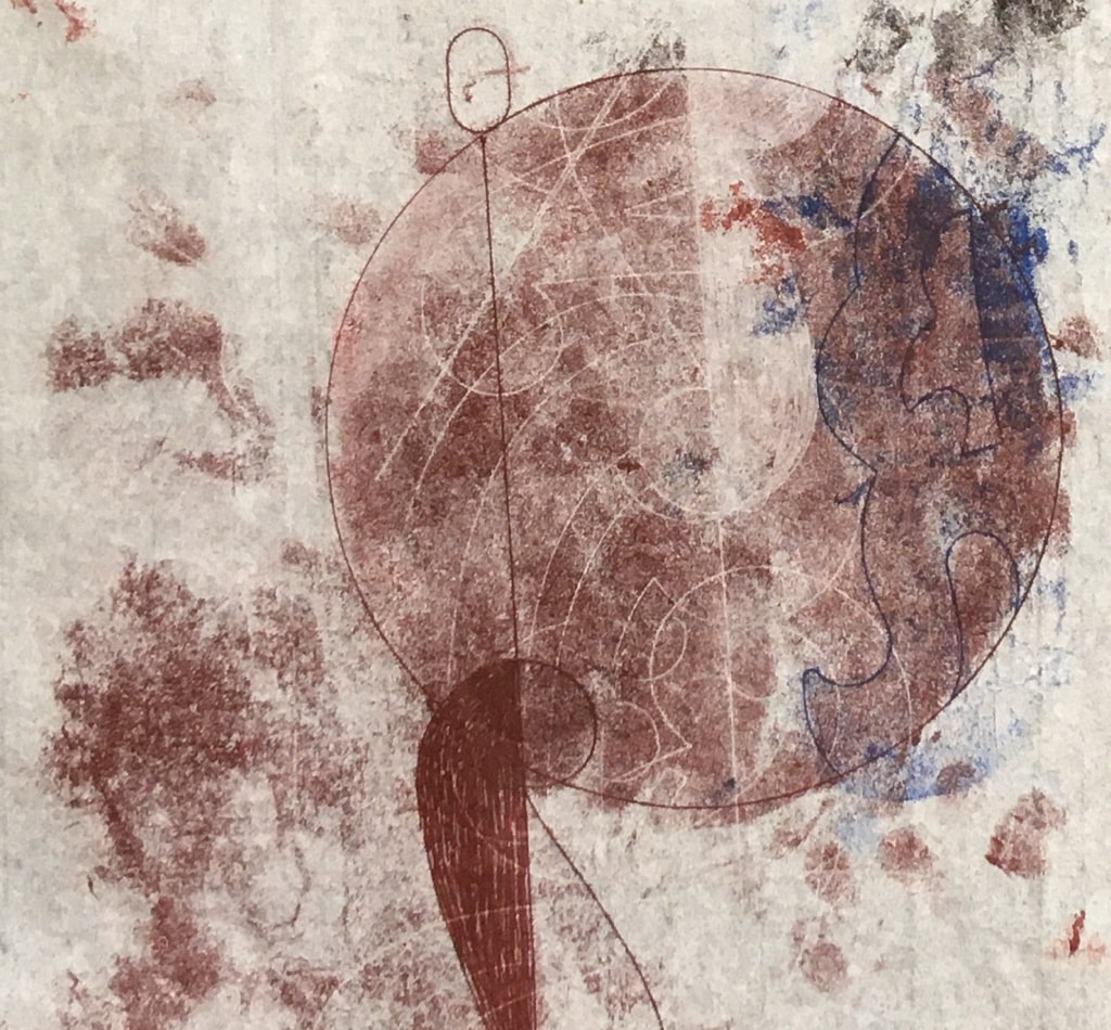
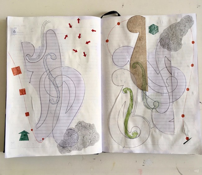
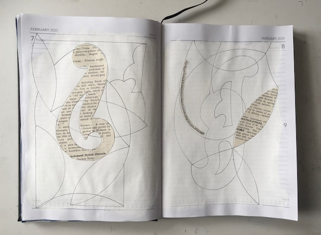
I can't decide whether or not this was a spooky experience, tracing my Dad's handiwork from many years ago. I noticed lots of things I hadn't seen before, such as some of the lines are broken at regular intervals with a little dash. I don't know why this is, perhaps they indicate the grid on which the curves of the yacht keel are drawn. I traced his numbering system, and how the years rolled back to see his familiar handwriting, but weirdly drawn by me. I even made myself signature initials in the same style which look nicely unselfconscious and fit well with the plan drawing. 
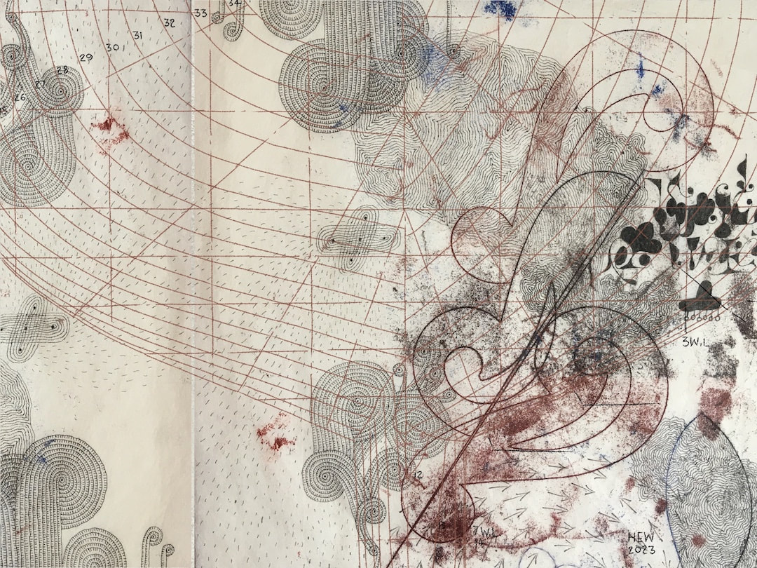
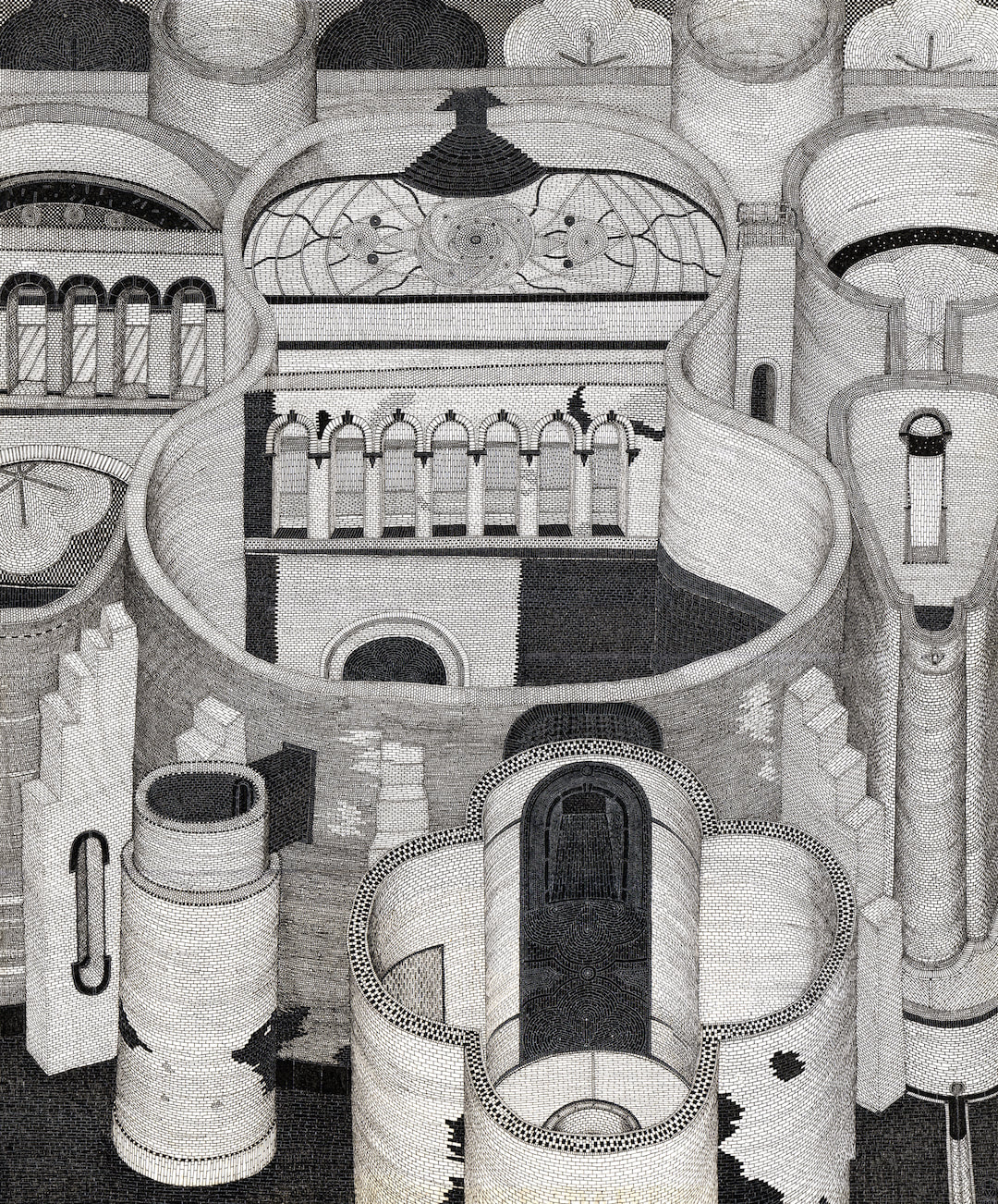
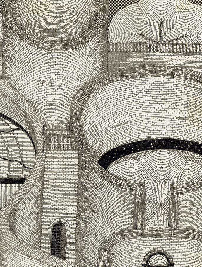
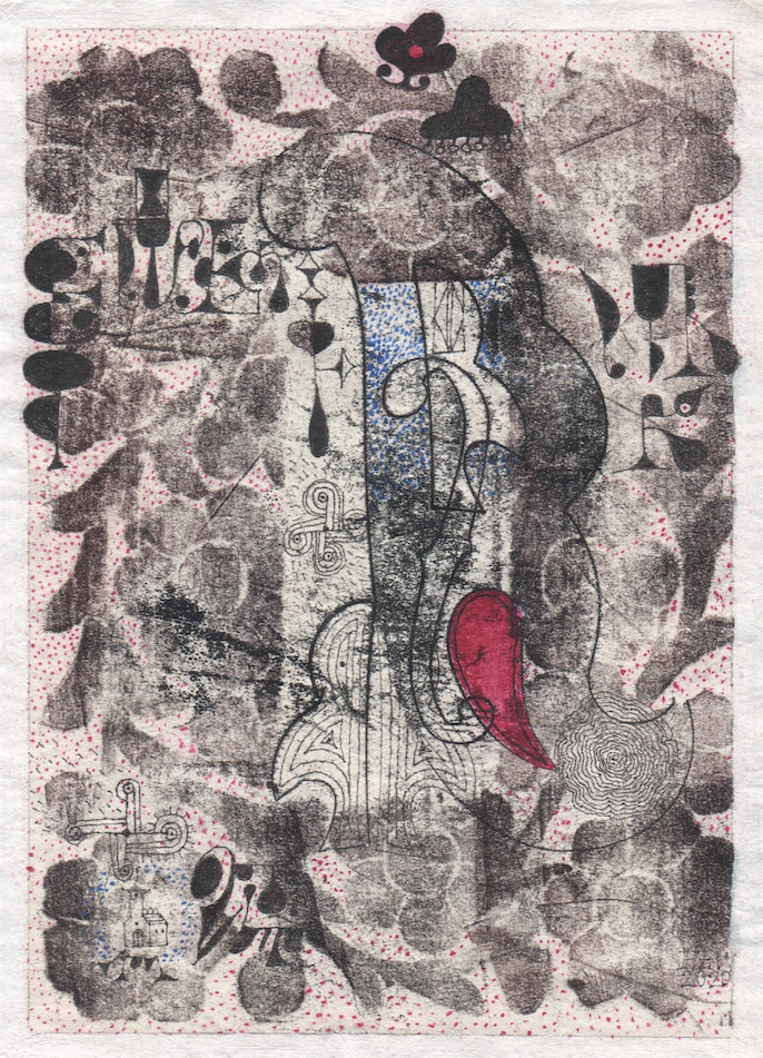
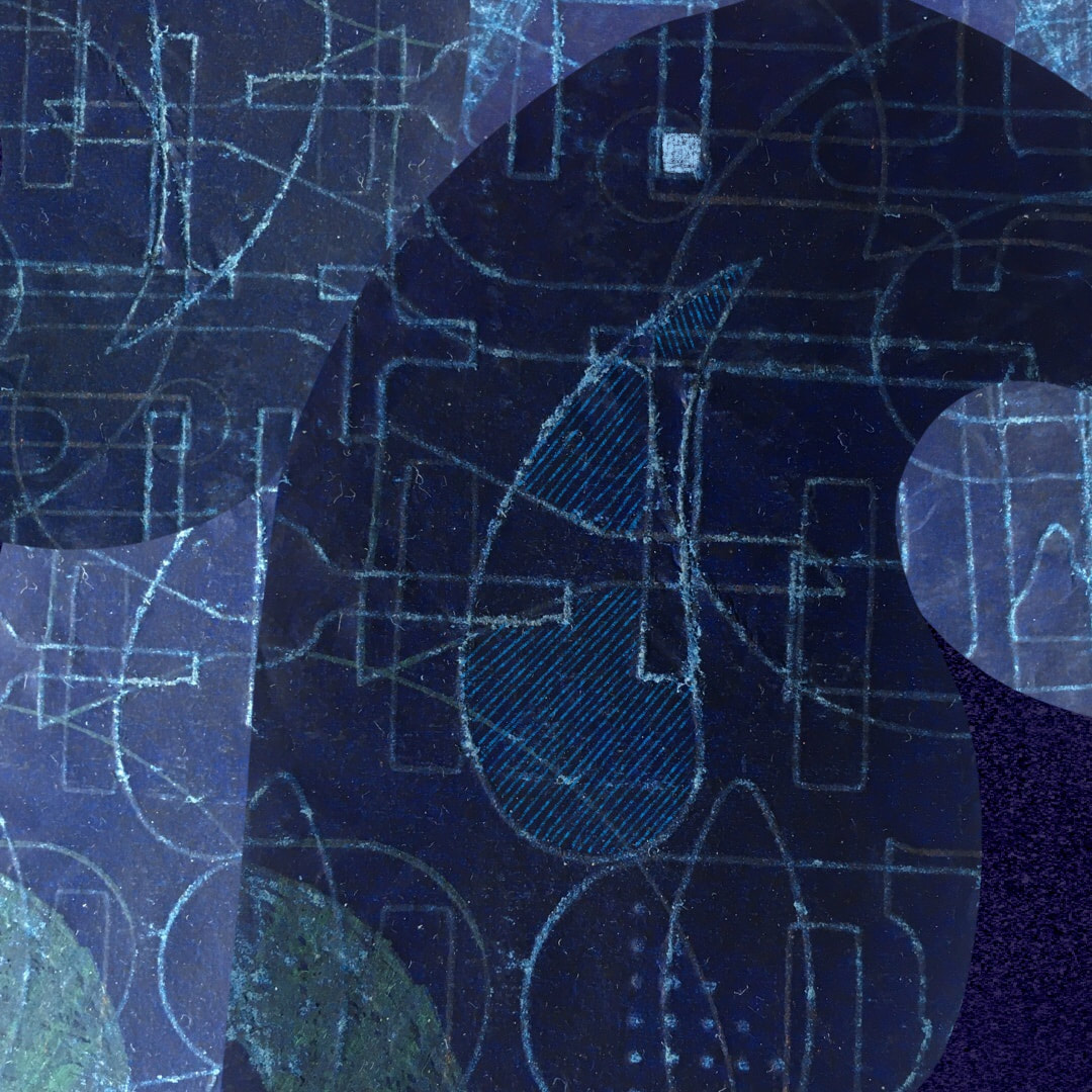
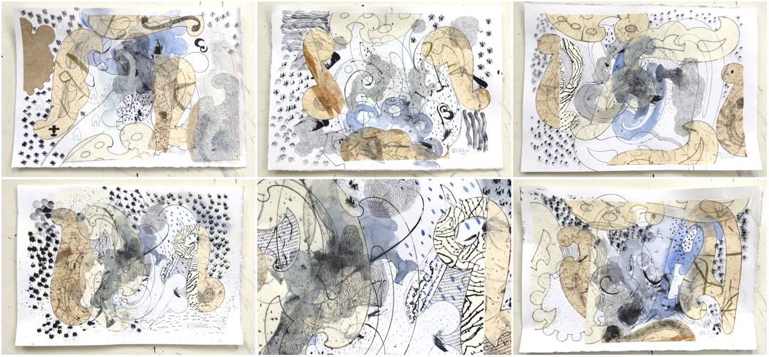
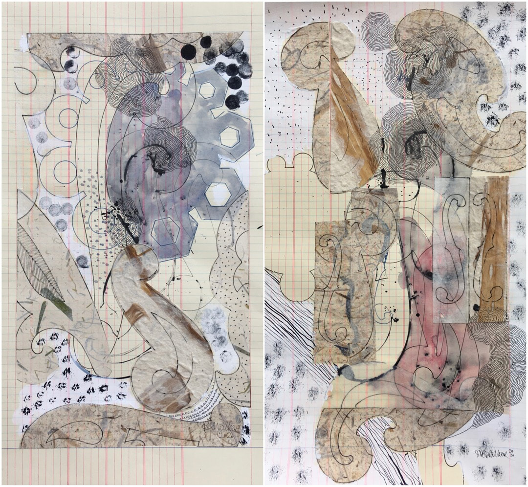
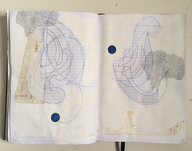
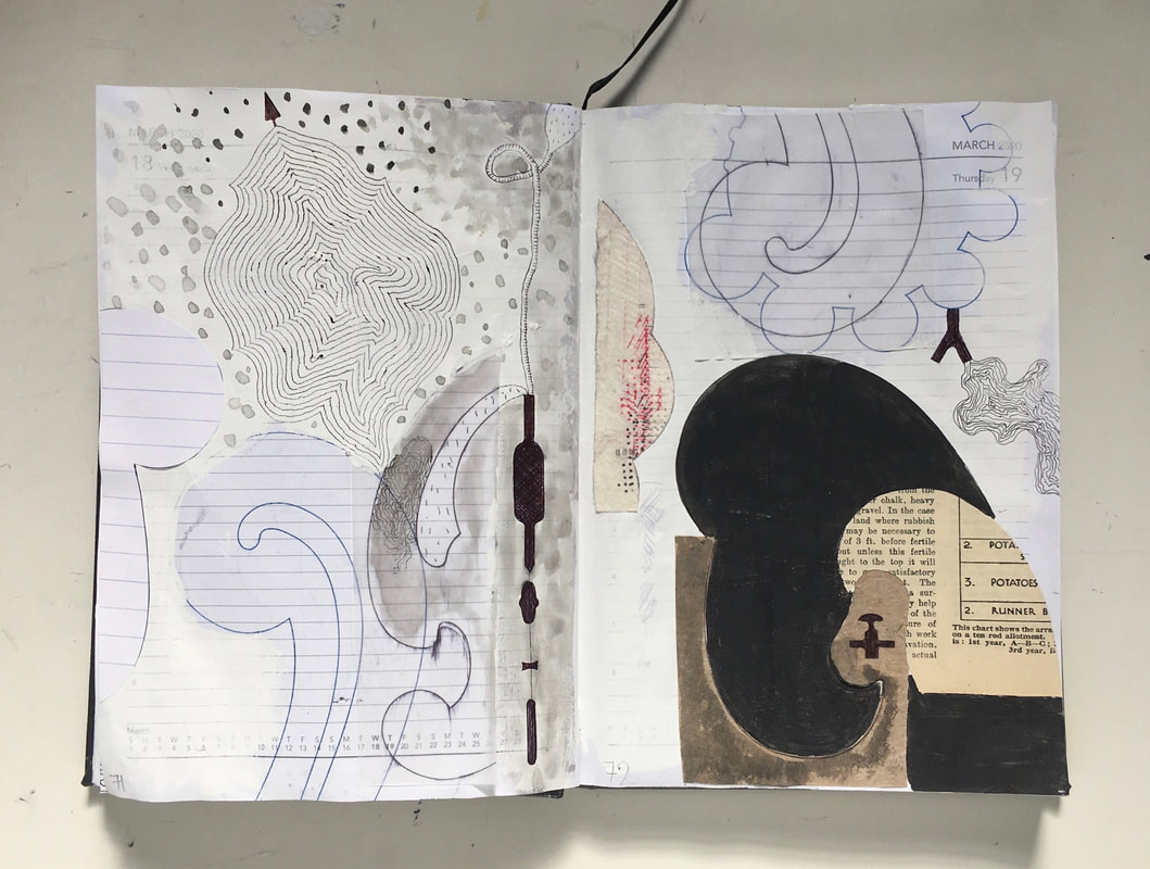
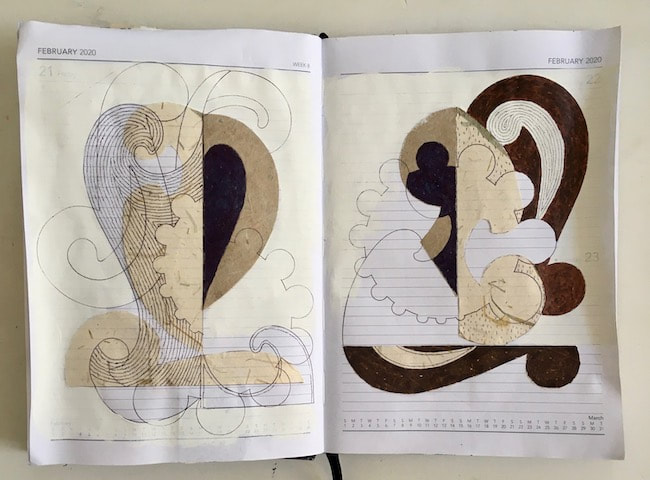
I worked digitally in layers which provided the excitement of being able to see architectural drawing in relation to my other drawings - interesting to see the one above using Dad's architectural templates he used in his plans, together with an actual plan drawing.
Another advantage to working digitally in that I can still explore ideas and work in poor light. I should have organised all of this in the winter months, but it's still useful even now when the days are drawing out and lengthening with the promise of spring approaching; the evenings are still dark, and my work room is still very cold. Working on more chair lugs this week, the cutting templates had been traced onto fabric and I was struck by the resemblance to my Dad's naval architecture plans. The templates are arranged for economy on the fabric, placed close together, fitted around each other, and drawn around in pencil. Darts and letters for positioning when sewing up are marked on each, resulting in an intricate and mysterious composition of subtle tonality across an expanse of about 250 x 150cm. The back of the fabric is a slightly mottled stone colour with shades of delicate greyish-blue along the sides, which adds to their beauty. As I cut the fabric around the pencil lines before sewing the pieces together, the 'negative' spaces in the form of waste scrap material emerged from between them and began to take on the forms of boats, ships, and submarines in my mind. My request to take them home raised a few eyebrows, but consent was gladly given and my colleague even kindly found a bag for them, so now I have quite a haul of the residue of a process, pictured above hanging over a bar to flatten out the creases. The leap of imagination which turns flat drawings into finished 3D objects is amazing, but these leftovers are going to play a part in quite a different process of flat drawing - the inverse of templates, the spaces around chair lugs, which become boats. I have frequently used my Dad's curves and other shapes (intended for things unknown to me in his drawings) as in this detail above; click on the 'Template Drawings' tag for lots more. My brother was a luthier, and I also have a few brass plates of his which were made for cutting F-holes in violins which have featured in my drawings, such as the one above where it's right in the middle of the picture. However, when I get around to it, this will be the first time I have explored the spaces left between templates, making them into boat forms related to my Dad's practice as well as Neruda's poem.
Inspiration during the week visited at work in the form of scraps left over after cutting around templates for chair lugs. To my mind they are boat shapes, which fits well with an idea for a project I have been playing around with in my mind for years to make work about a line from Pablo Neruda's poem If You Forget Me : ... as if everything that exists, aromas, light, metals, were little boats that sail toward those isles of yours that wait for me. My first idea, years ago, had been to make lots of small clay open canoe forms with inclusions fired into their cavities to represent the aromas, light and metals, and arrange them as if travelling in a river to flow around a space. Later, however, after my Dad passed I inherited his architectural plans. Amongst them are drawings for a large yacht which was built some time in the 80s, I think. These particular plans have been a source of inspiration for me ever since. The mathematical beauty of the drawing's abstract sweeps and curves expressed in simple bare lines negated my first idea of using rough clay for work based on Neruda's words: too clumsy, I thought. I had begun to feel paper might be a better choice; the fact Neruda uses the word 'little' to describe them indicates a vulnerability, delicacy, or fragility. Then, some time ago I unconsciously started 'doodling' paper shapes into tiny, long boats. I hadn't even noticed what I was doing at the time, but after one had hung around in my work room for a couple of years I realised I was still thinking about Neruda's boats. You can find Neruda's full poem after the Read More break.
I began adding brick structures to the drawing this week, using my Dad's old curve templates to reinforce the The Architect's Garden theme. I began by making mosaics of the brick and tile shapes which fit inside the curve shapes behind the floating organisms. I began one quick experiment in my sketchbook, playing with making a solid brick structure from the curves. The first one here is a bit dodgy, and the yellowish smudge on the left is a bit of dinner - gross, I know, and professional to the end! (That would never happen to one of the actual drawings). I'm a bit out of practice since the 'Empty Spaces' brick drawings of early 2014, I haven't made any brick drawings since; but The Architect's Garden work has renewed a purpose for them combined with all the templates diary work I did last year, so it's perhaps time to brush up on my technique. I haven't yet decided how illusionistic I want the bricks to be for the current work, only that I don't want it to be 'clever' as in Escher's wonderful works; so there will be a bit more sketchbook work (sans dinner, hopefully) until I make up my mind. The decorative, flat mosaic style may be more appropriate for the drawing I'm working at the moment, but I may do something different in the next one. Below: Empty Spaces 3 2014, and a detail of the drawing. I did a lot of bricks back then! I forget the exact dimensions now (the original is stored in the loft) but it's somewhere in the region of 60x80cm. The materials are still pretty much the same as I use today; mapping pens and rotring technical pen on Japanese tissue.
My 'honorary brother', Ian, has been in Venice for a few days. We grew up together in the same street in Scotland and did our spell in London at the same time, but now he lives in Germany so I don't see so much of him (especially these days when nobody sees much of anybody!) but we speak twice a week on the phone. Every day when he was in Venice he sent me photos of his hotel and places he had been, which I am sure unconsciously rubbed off on me because as I was deciding on a title for this one I realised there were references to canals, Renaissance buildings and motifs, the romantically scruffy and slightly broken feel of Venice, misty vague shapes, and I noticed the unreadable writing in a foreign language (asemic text) had a distinctly dangly appearance. Ian had sent me a photo of the most beautiful old Murano glass chandelier (in his hotel bedroom!!!) which made a huge impression on me - I love it so much, I reckon without knowing it the chandelier influenced the delicacy and suspended nature of the lettering.
So, this one is titled Letter From Venice. It will be going off to the Open Eye Gallery in Edinburgh for inclusion in the annual Christmas Exhibition On a Small Scale along with two other works of A5 dimensions. The exhibition is going to be online for the first time in its history. It was a good move on the Gallery's part because who knows which Covid alert tier Edinburgh, or any of our cities and towns, will be in next month. If the spread of the virus doesn't slow down it could happen that non-essential businesses will be forced to close their doors again. If that does happen, the show goes on - three cheers for the internet! I am making plans for what I'll be doing with the small scale works now the monotype ink has dried thoroughly. At the moment they are being pressed flat, so I will be starting work on them this week, aiming to have four ready to ship to the Open Eye Gallery in Edinburgh by the end of the week. This one pictured above returned to an old favourite shape I have used a few times in the past, which comes from an old wooden Indian salt box. I drew around it onto a piece of card to use as a template alongside my Dad's old ones.
I got nothing done yesterday because I was making face-masks in colours for autumn and winter wear - I say masks, but in fact it took nearly 5 hours just to produce one. I had only intended spending a couple of hours on it, but I was working from a tutorial which I loved, but which I simply could not get to work. The new masks differ from the ones I made earlier in the year in that they have vertical pleats instead of the horizontal ones more commonly in use, designed to be more comfortable because the mask doesn’t touch the nose and mouth; however, I just couldn’t figure out the measurements. I spent a while cutting out a template as per instructions and everything, but it still wouldn’t work. There wasn’t enough room to make pleats by the time it was stitched up, and I noticed at this stage it was already mask-sized before any pleats went in. I’m wondering if the measurements given were for the finished product and not the cutting size? In addition, my sewing machine simply would not sew over the elastic straps so I spent ages faffing around before realising it would be so much easier not to try with the machine, but to leave holes to poke them in and hand stitch at the end. Eventually I did it with gathers around the nose and under the chin instead of pleats, and it was a success in the end so at least I got something out of the day. It was much more breathable and comfortable than the others, too. It was fine for me, but much too small for B! I’ll be back on mask-making this afternoon, this time I’m going to work backwards with the measurements to get the dimensions for cutting out the fabric. Look at all the scribbling and scoring out all over my mask template! It's not my tidiest work. Monotype drawings have been a long-term favourite of mine, ever since I learnt the technique in 1981 at Gray’s School of Art in Aberdeen. I began some new work this week, bearing in mind what I was thinking last week about allowing more space for the work, and decided to start with monotypes of my father’s old templates.
It meant (horror of horrors) having to clear out my work space, involving a lot of shifting things around and putting things away to make room for my toughened glass plate on the table, which in turn led to an incredible amount of dusting. A rethink and reorganisation of the work space is a great way to begin a new series of work, though, and I was excited when I could eventually begin! As usual there was the initial panic that nothing would come of it and that I wouldn’t ever be able to make art again, but the best thing is just to start somewhere and get marks onto those scary blank sheets of paper. I love the monotype process so much it it was just a few moments before I was totally absorbed. The marks, accidental and deliberate, are their own inspiration. Below is a detail showing lovely stony textures and pale lines left on the plate by the drawings which happened earlier. I was photographing some of the templates diary work during the week when I noticed I was getting good images of some used carbon paper. I had been drawing templates through it to get that particular blue line, which somehow manages to be crisp and fuzzy at the same time; also, I love that particular blue colour. After the sheets of carbon have been used over and over I had noticed the shiny side becomes an intricate lace of inverse lines left by pressing through the back with a biro to transfer the line onto paper. I have tried so many times to capture it - scanning, fancy lighting, getting close up with the camera, but to no avail - no detail showed up at all in the images.
I had cut template shapes from the used carbons for some compositions in the diary, and these were amongst the photos I took this week. The natural light of summer was so good I saw that at last I had managed to capture those elusive lines! They were so interesting I brought them into Procreate on my iPad, cut them out, and composed this image - maybe an idea for a painting? I was honoured to receive this comment when I posted this work on Instagram the other day:
To me, your work is a really inspiring example of how to take a set of artistic questions, ideas, and feelings and truly explore them, rather than just skating the surface ... I was bowled over by this, not just because of the praise but because it came from an artist I highly respect and admire. Known as Daniel, please check out his Instagram Graphopathy - it is fun and inspiring and very intriguing. Titled Ball Game, this work is available on my Etsy store, listing here For weeks now I have been contemplating how people or characters might look in the templates drawings. The little figures above came out of the children's book I have been illustrating. I made this digital mockup with one of my recent drawings on my iPad and was quite taken with how the people look solitary and overwhelmed by their environment. They look like explorers on their Grand Tour, but the scene also reminds me of our local park where people are taking their daily exercise during lockdown. The entrance to the park is on a hill overlooking the park, and solitary walkers can be seen scattered amongst the trees and meadow areas. In that respect it brings to mind the works of Lowry, or even some of Henri Rousseau's beautiful works like Carnival Evening.
Well, last week I simply forgot to post this. I did the same with my Binky McKee illustration and design blog, I left both posts in drafts and forgot to publish, so I backdated it today. I was most interested in these leftover pieces of cutout template shapes, strewn across a piece of paper - they really do look like a strange calligraphy.
Another six from the series of Indian frame rubbings. No new work this week, but I find myself thinking a lot about the templates works, especially in the night in that state of half dreaming. They keep appearing to me with figures in them - yes, people! - something I haven't worked with for years. I am interested in the idea and it makes perfect sense in the wee hours, but when I am fully awake the images slip away as soon as I have conjured them in my mind. I guess the only thing to do is try it one day and see what happens.
A number of warm, sunny days last week got me out into the garden, working in my pop-up tent. It fills up rapidly with art materials, papers, tools, brushes, pencils, pens and jars of ink and is all rather precarious. The wind at one point was flapping the tent walls so hard the whole tent was leaning and threatening to spill my water jar. At one point the jar of ink fell over, luckily inside an old, thick-walled leather satchel which has seen it all in terms of art material accidents - the lid wasn't on properly, and ink spilled into the corner of the bag in a puddle, strangely enough in exactly the same place which bore a stain from a similar accident years ago. Such hindrances I took in my stride - they go hand in hand with working in a tent, and I managed to power through a lot of work making frottage prints of two wooden Indian frames as a basis for riffing on the templates theme. After the frame prints I made monotype drawings of some of the templates. Here are some of the templates cut out and thrown down on a piece of paper, ready to use. I thought they looked like a strange alphabet, flying up in the wind to form words.
By the end of the day, the remaining ink on the glass palette not only bore the residue of beautiful marks but had the perfect consistency to make monotype drawings. It's my birthday today, and I opened an Etsy shop as a gift to myself - at long last! I will be stocking it gradually with watercolours, including these 6 from the week. When I have enough listings to make it interesting, I'll link to it from this blog.
In the mean time, I hope everyone enjoys the bank holiday weekend in lockdown! I discovered a liveliness in the work this week, and was surprised when I began to recognise work from my past coming through. I am going to hark back to my days at Gray's in Aberdeen again, because something in the distribution of weight, tone, shapes and marks goes right back to then. Around 1983 we had a class trip out west to sketch the sea and mountains (I think to Tighnabruaich, I may be wrong). Following on from the monotype landcapes I talked about previously, I had begun to develop landscape paintings using lots of inky splotches and dark areas crossed by even darker spots and lines, but on that trip it really came together. Unfortunately I can't find any of those now, but I did refer to them a few years ago in a large sketch book, where for three pages I made little drawings of fruits using every mark I could imagine and a number of tools to make them, including home made quills from bird feathers, and my finger tips. I haven't worked this way for ages, and I am really enjoying it - it's weird how some things just never go away. These fruits were ideas to decorate ceramics.
|
Welcome to my work journal - a weekly update on drawings, work in progress, doodles and day-dreaming.
I changed the website address a few months ago, so some older links on previous posts are broken. If you click one of those and it takes you to a strange page, simply replace the .co.uk after the heatherelizawalker. with weebly.com and it will work again. <<<<<<<<<<<<<<<<<<
<<<<<<<<<<<<<<<<
>>>>>>>>>>>>>>>>
As well as the work you see here, I illustrate under the name of Binky McKee (my mother's maiden name was McKee, Binky was every single one of my great grandmother's many cats!)
If you would like to visit my Binky website, please click the picture above. <<<<<<<<<<<<<<<<
Dissolving PeopleA symbol on the footpath outside a local primary school gradually disappearing as the image breaks up and wears away until eventually it is obliterated by leaves and barely discernible. Photographed at intervals of several months between February 2021 and November 2022, oldest at the top.
(My shoes look so new in the first pic, and note the transition to new phone in the last photo). <<<<<<<<<<<<<<<<
<<<<<<<<<<<<<<<<<<<
All
<<<<<<<<<<<<<<<<
<<<<<<<<<<<<<<<<<<<
April 2024
(Sorry the archives don't nest!)
<<<<<<<<<<<<<<<<
>>>>>>>>>>>>>>>>
A 2013 work book, still very much in use Please note all images on this website are ©Heather Eliza Walker 2013 - 2020, and may not be used or reproduced without prior consent. |