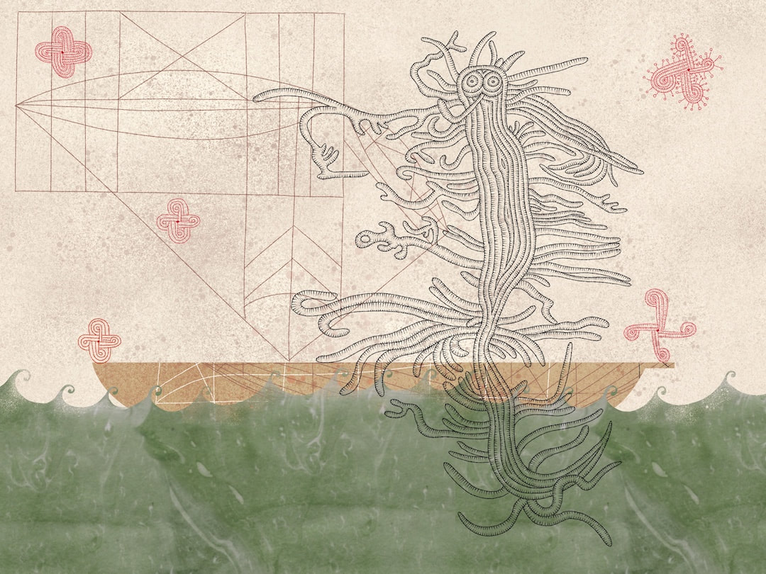
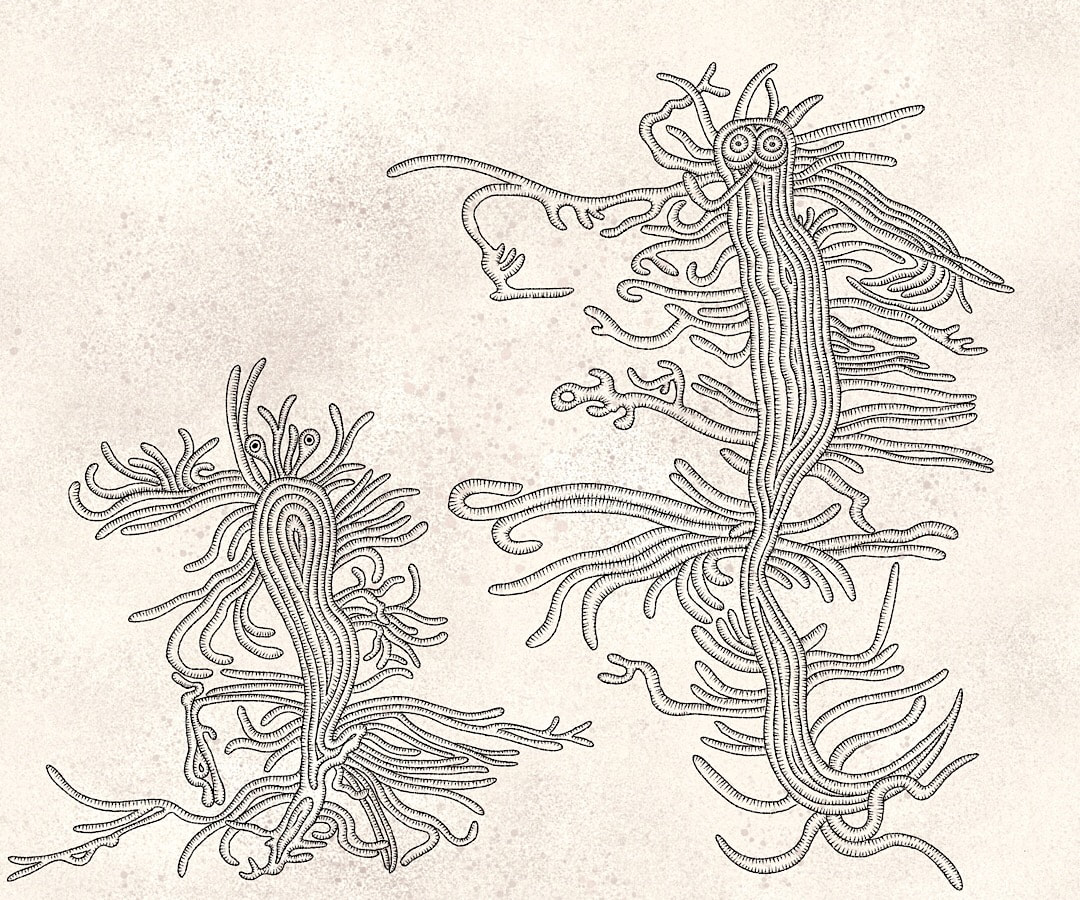
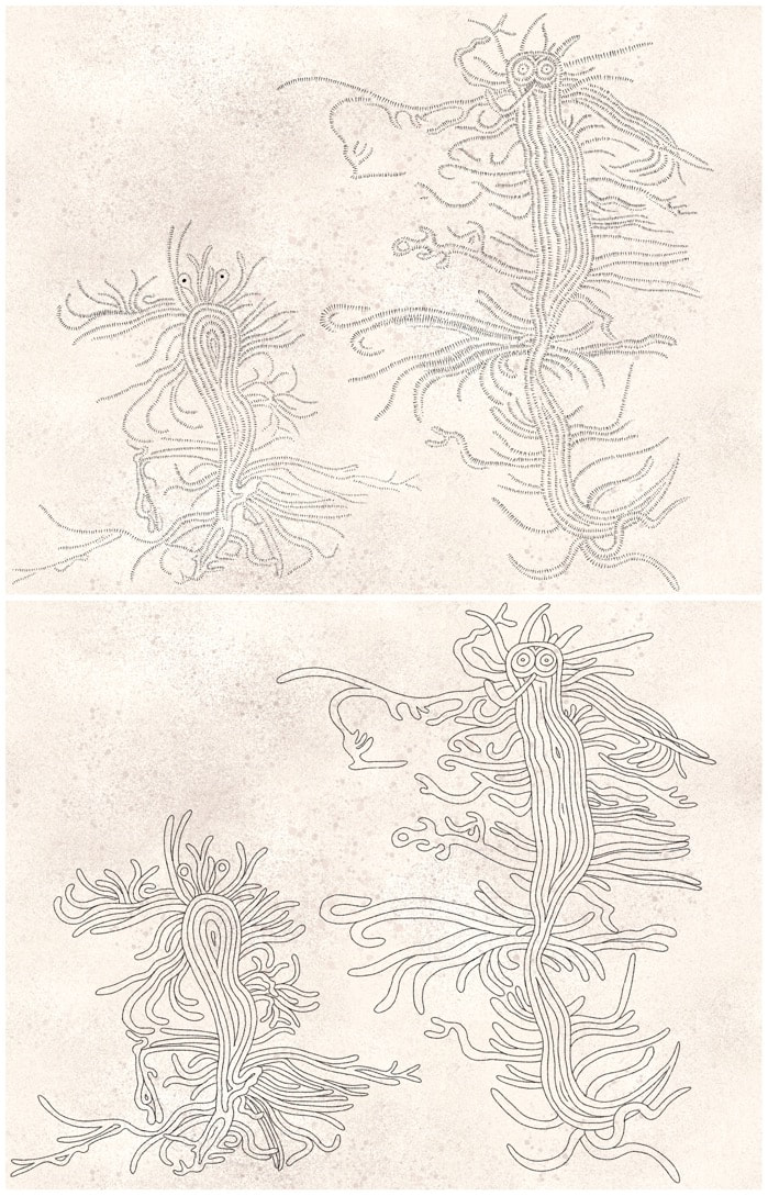
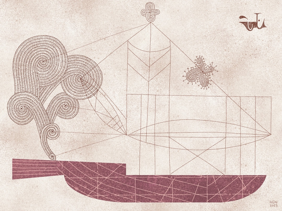
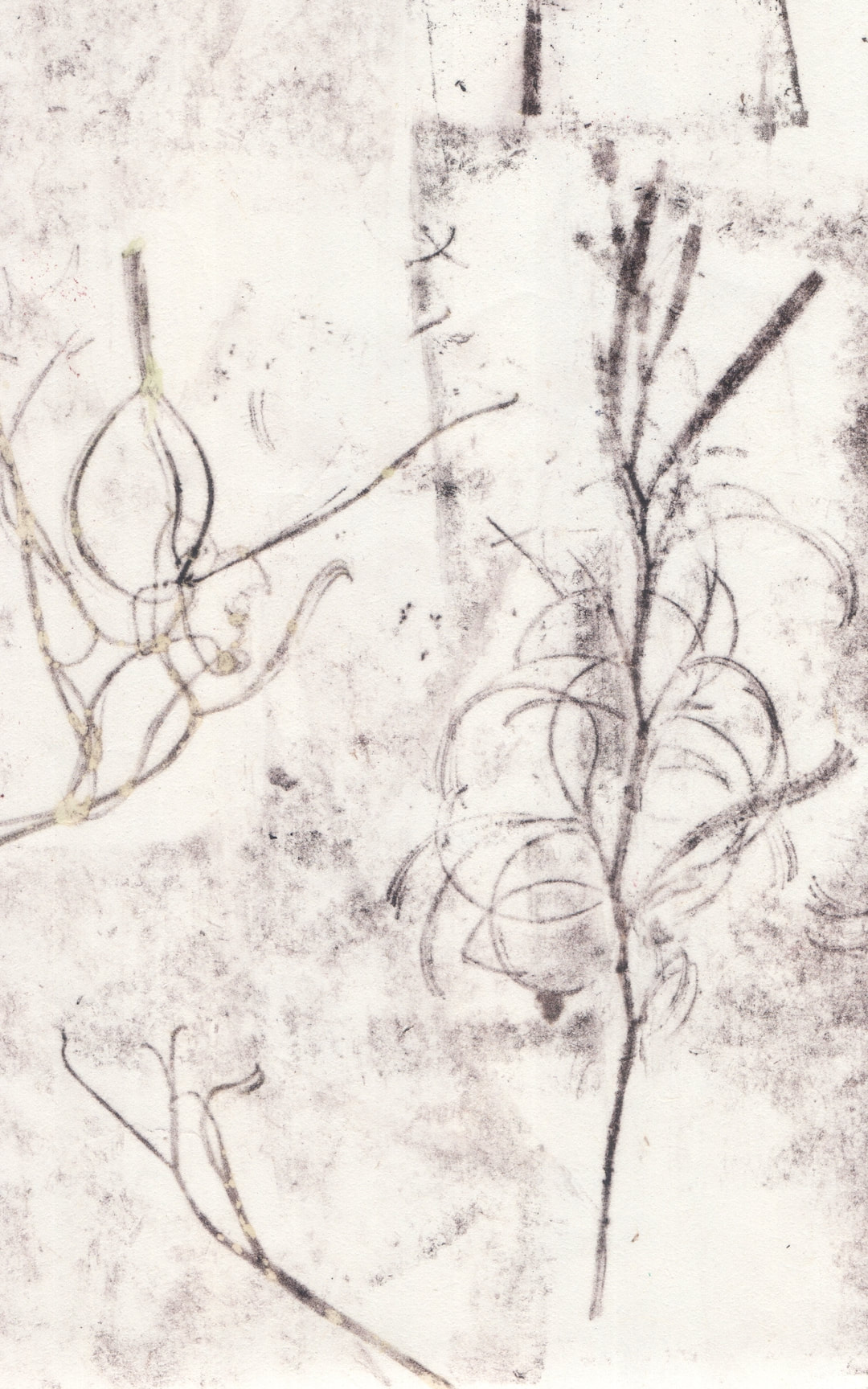
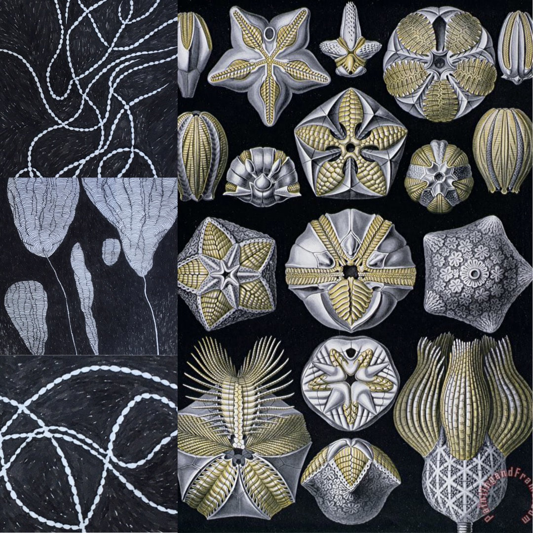
Collecting images and putting them together in Procreate to see how they talk to each other, this lobster creature looks as though he is playing the harp with one of the Polynesian navigation chart drawings. I thought it looked like some fisherman's weird dream, perhaps rather a horrid one in which he turns into a sea monster! Fisherman's Blues came to mind as a title, named after one of my favourite albums of all times by The Waterboys. The ocean crests are borrowed directly from one of my Binky McKee book illustrations, the sort of fruitful melting-pot mix Procreate enables which I particularly enjoy.
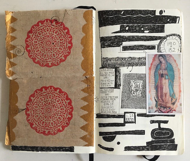
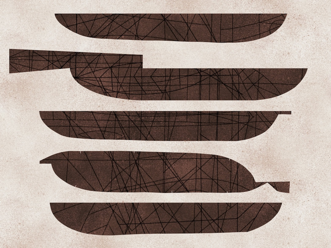
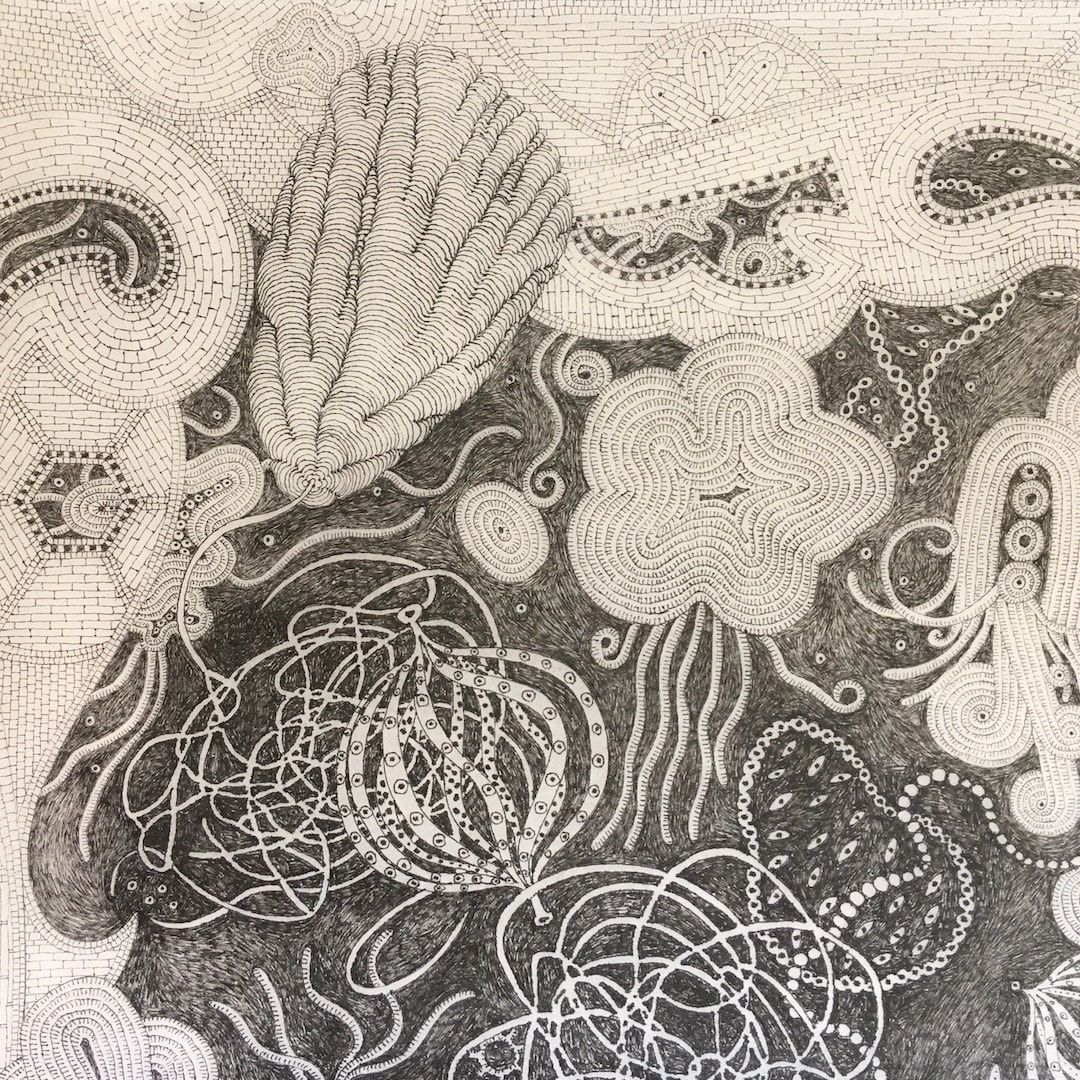
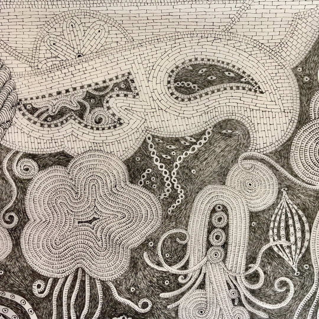
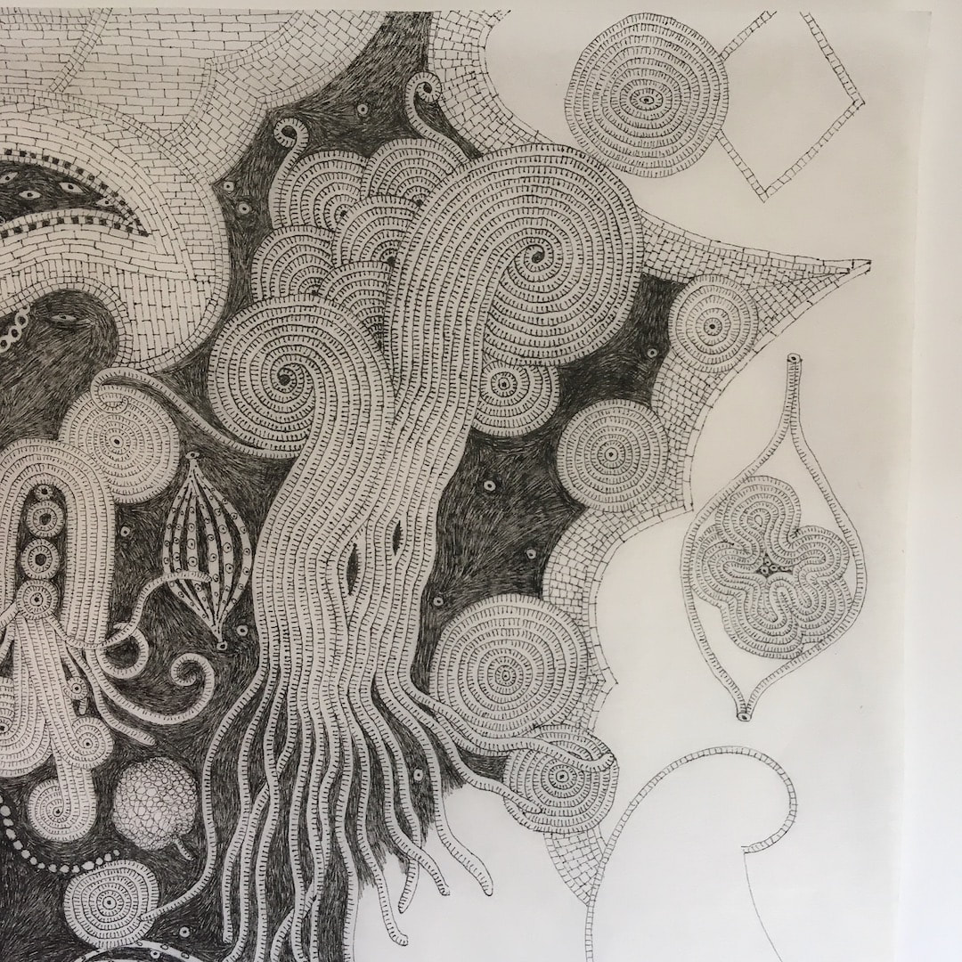
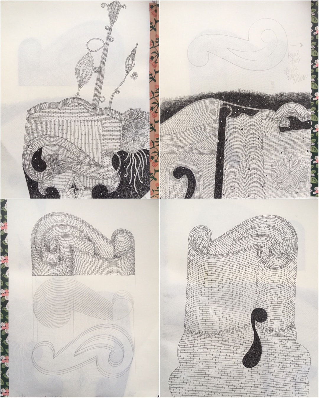
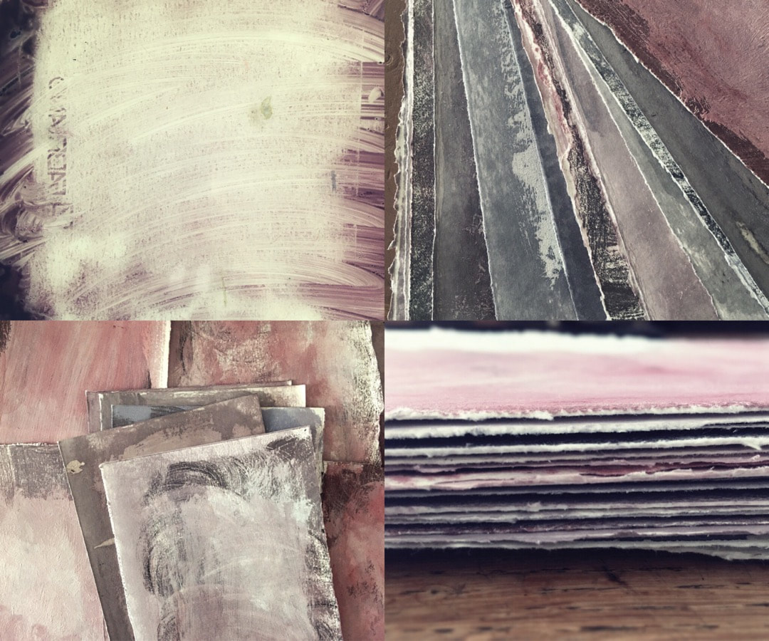
I have been working on making some of the recent images a little larger, which means scaling up and redrawing to keep crisp lines. Because most of them originated a few years ago with no other thought than to use them for Instagram posts at 1080px, they are very small; but I am thinking they might make nice prints, so I'm keeping my options open and increasing the size of canvas. The dimensions of this one would be 289 x 216mm at 300dpi, which is a nice size suitable for the subject matter. Otherwise, if I printed any of the recent compositions some of them would only measure 181mm on the largest dimension, which is a little bit too dinky.
I have been working on making some of the recent images a little larger, which means scaling up and redrawing to keep crisp lines. Because most of them originated a few years ago with no other thought than to use them for Instagram posts at 1080px, they are very small; but I am thinking they might make nice prints, so I'm keeping my options open and increasing the size of canvas. The dimensions of this one would be 289 x 216mm at 300dpi, which is a nice size suitable for the subject matter. Otherwise, if I printed any of the recent compositions some of them would only measure 181mm on the largest dimension, which is a little bit too dinky.
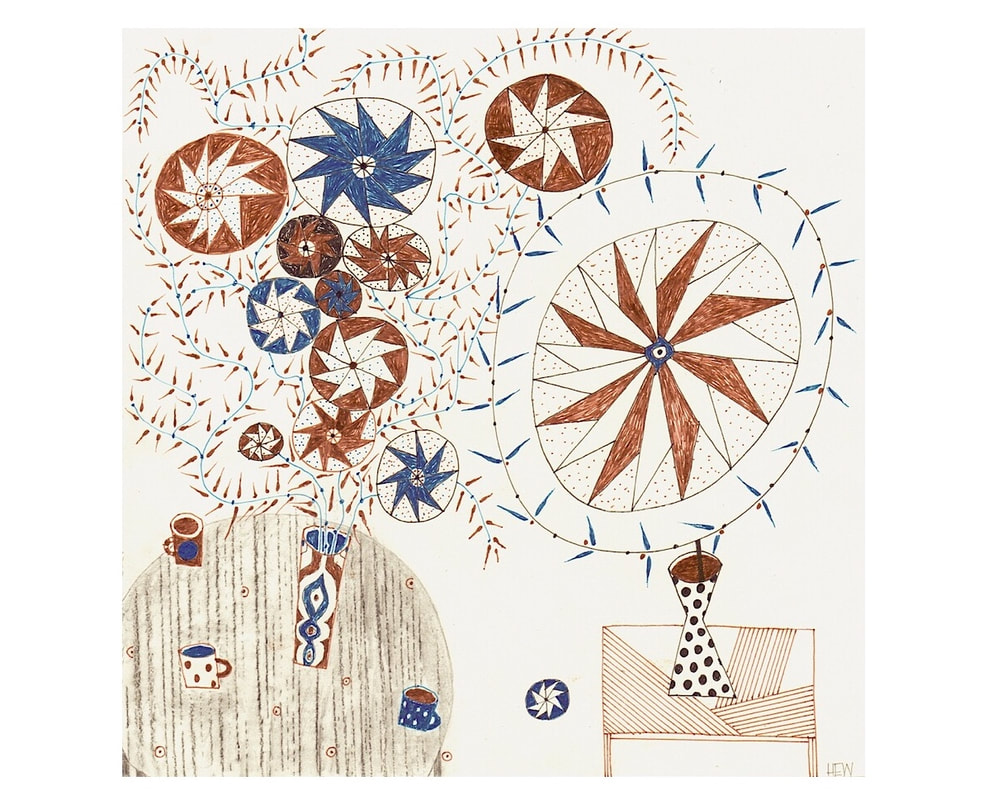
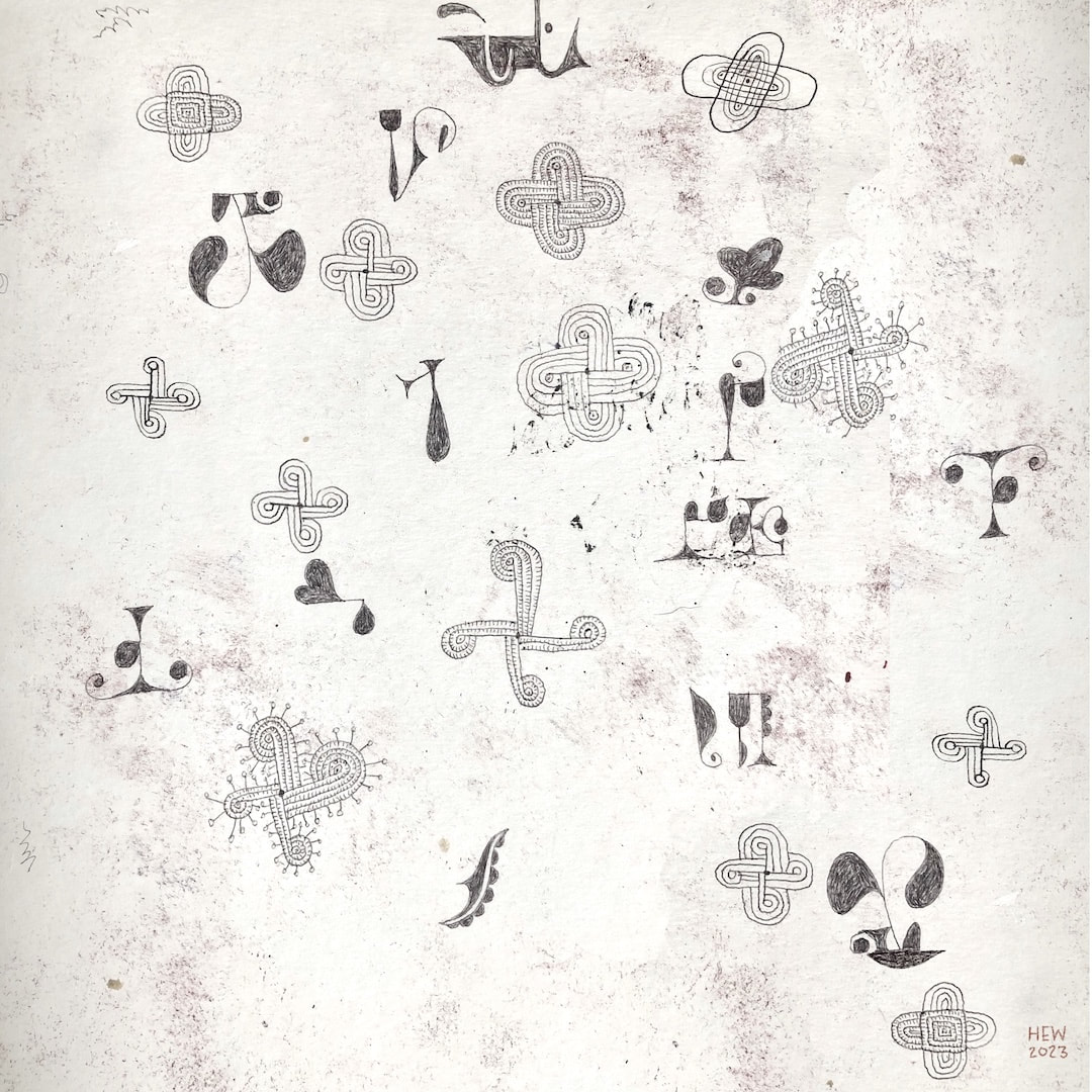
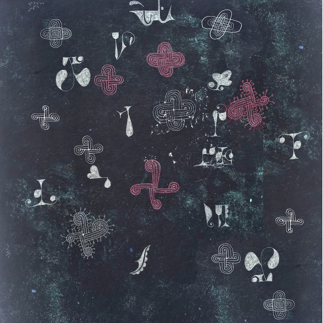
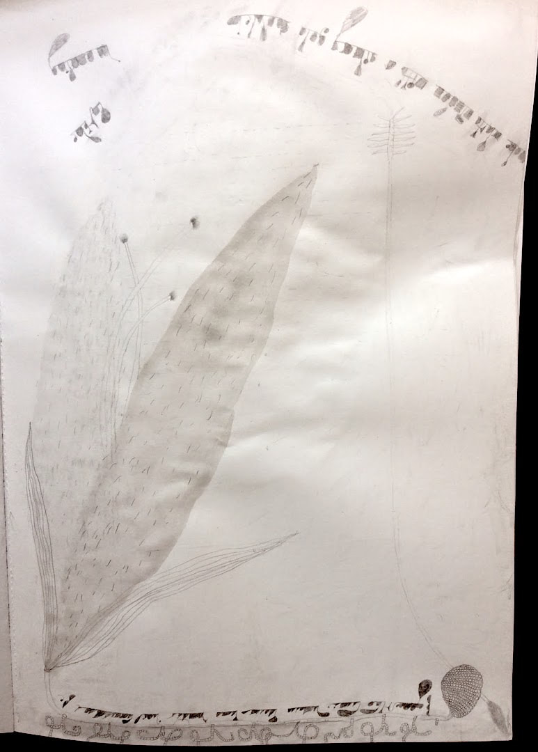
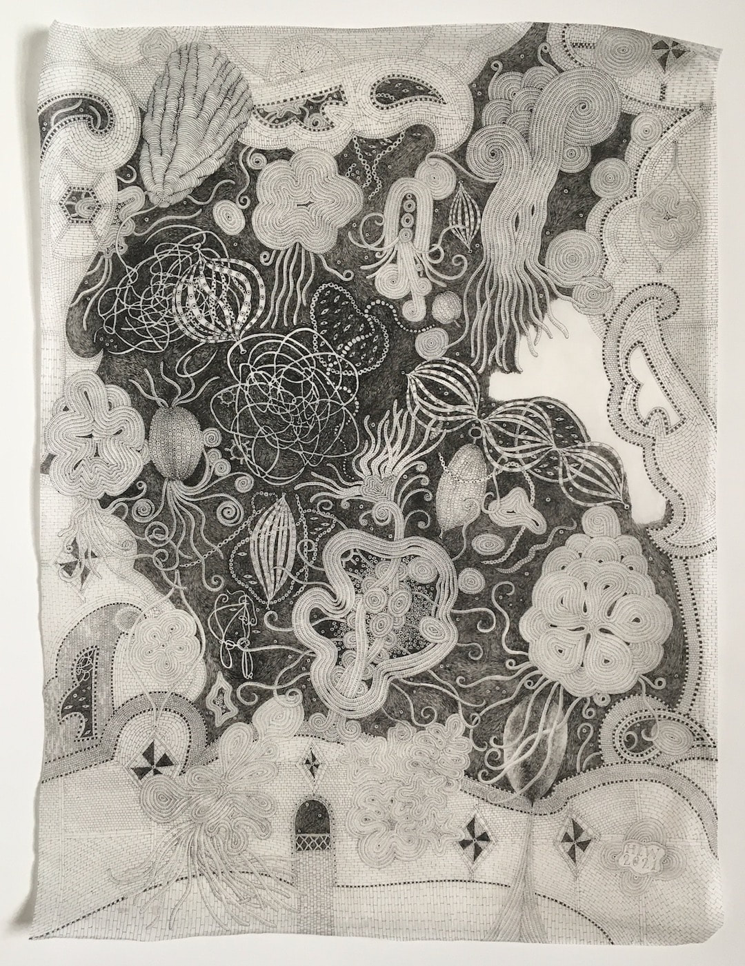
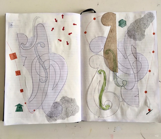
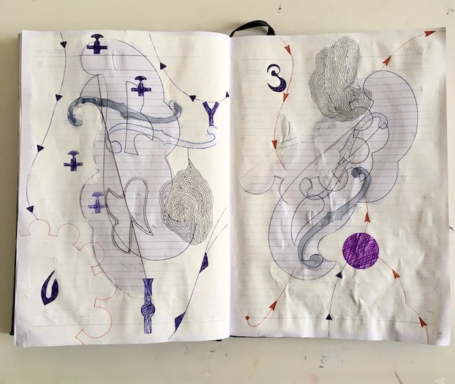
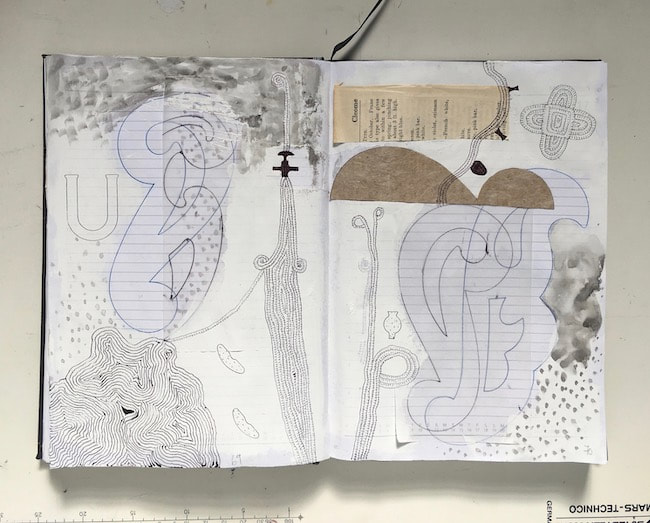
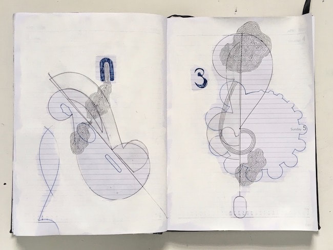
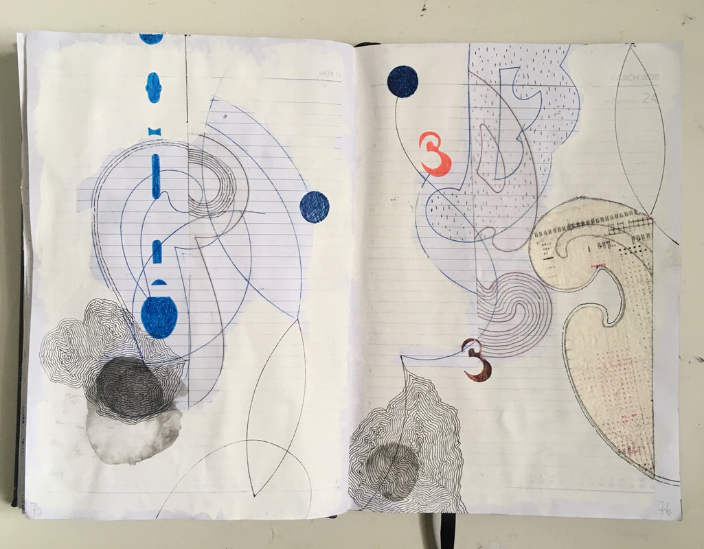
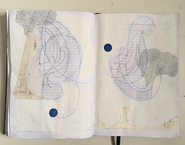
I have had this framed drawing lying around in my work room since my 2018 Brave Oleander exhibition at the Open Eye Gallery in Edinburgh (eek, I had blonde hair back then, I'm back to my native reddish now!), but during the week I hung it on the bedroom wall. It is daily drawing no.98 from a series I worked in 2016, titled Really Good Coffee. It looks great in its new position. Its sharpness, clarity and brightness has an impact which belies its small scale of 189mm square, and it is great fun - so I am thinking now a revisit might be in order. Accordingly, it has been mentally added to my current Neruda's Boats project. This magpie stage of collecting and bringing together all sorts of aspects of my work is an exciting process.


 RSS Feed